11 Email design best practices to follow
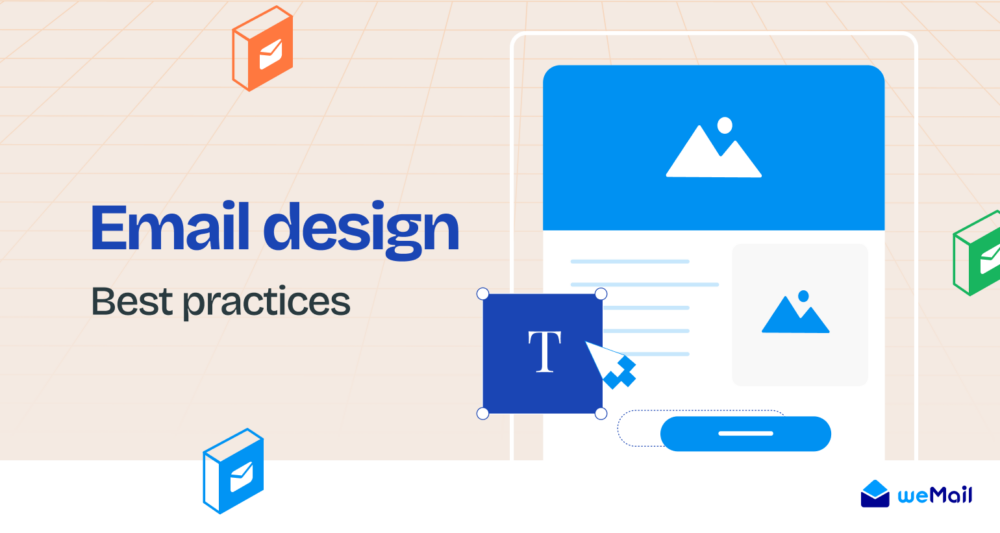
Email design shouldn’t only be attractive. It must aim to guide the recipient to make an action.
The necessity of a well-designed email is often overlooked. Most email campaigns fail to bring an expected outcome for that reason.
This blog will show you some proven email design best practices to create visually appealing and actionable emails.
Why Email Design Matters
After a recipient opens your email, the design grabs his/her primary attention. A visually engaging email is what you need in the first place for conversion.
An email design is a process of creating the visual outlook and most of the UX of your email marketing campaign.
It’s not about how beautifully you create an email body, what matters is how effectively your email works for visual interaction.
Suppose, you have created a vivid nice email with irrelevant images. What happens then? It won’t do the talking and guide customers to body copy.
Email design is so crucial because if rightly implemented, it surely creates a good user experience, and influences the decision-making process of a subscriber.
Key elements of email design
Check out the indispensable elements of email design mentioned below. You can add more elements, but these are the most crucial ones –
a. Email header: This is the part where you introduce the content of your email. Mostly, you put a brand logo in this section.
b. Email body content: Contains the main message of the email, incorporated with email body copy. For the design part, fonts and layouts are incorporated here.
c. Call-to-Action: Choosing the color, shape, fonts, size, and locations of the CTA – all of them are important.
d. Visual elements: make up your mind for using images, and any kind of visual content like GIFIs or videos.
e. Footer: Usually contains email signatures, social media buttons, unsubscribe buttons, and addresses
Besides these elements, there are things like gamification of email or interactivities. For example, you can use voting polls or content-accordions.
Last but not least, mobile friendliness. According to TechReports, 42% of email recipients open emails using their mobile devices. So, how many of your emails are mobile-responsive, that question must be answered.
However, most email platforms offer highly responsive email templates nowadays.
Proven email design best practices to learn from
1. Create a base template or module design first
An email template shouldn’t only be a beautiful one. It would be best if you created something functional and effective for the target audience.
Instead of creating a new design every time, it’s wiser to build a model that reflects interactive aspects and your brand value and maintains all the functionality a highly converting email design should require.
Most email marketing platform offers responsive template library to initiate your email designing process. With weMail, you can achieve even more freedom to customize your email templates.
Here’s an example of a predesigned email template from weMail –
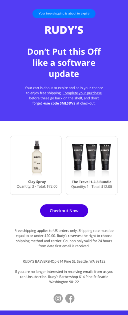
The template has three main parts – header, body, and tail. It’s an abandoned cart email template, and just above the brand logo, it has an offer pitching with the FOMO effect.
If you create a similar module for your email campaigns, it won’t be necessary to design from scratch every time.
2. Go for a responsive design earnestly
We’ve mentioned this earlier. Today, people open their emails using multiple devices.
So, your emails must have the functionality to respond on all the screens like mobile, tablets, and laptop screens.
To achieve this feat you can utilize CSS media queries. However, the best way is to go for a responsive template library. There are hundreds of resources and thousands of free and premium options to get your hands with.
3. Maintain consistency in your email design
Maintaining consistency is important for your brand value. Create a style guide for email design, and whenever you opt to create a new email campaign, follow the guide to ensure a consistent use of elements. That will make your email achieve a significance among your audience.
If you look at the most popular brands, you will find this consistency in color, fonts, layouts, and even the language pattern in the body copy.
Check the following emails from Uber –
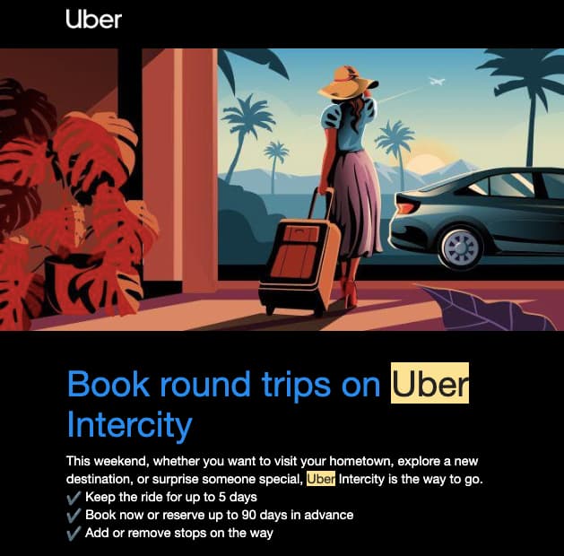
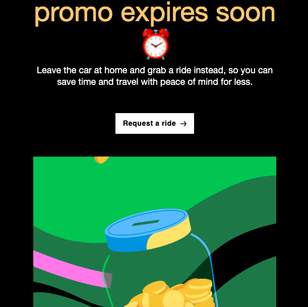
The goals of these emails are different, so the image and copy reflect it. Hence, you don’t need to be a UX designer to understand how both email follows the same style guide and evoke a consistent brand value.
4. Go for a dynamic framework
You can’t always be strict with your vision and implementation. You should make room for last-moment improvisation.
It’s like you’ve planned to add a CTA just under the brand logo, and while implementing, your marketing expert proposes a more logical position. You must keep a flexible process and align your design team to bring these changes whenever necessary.
5. Incorporate UX design best practices into your email design
Rule of thumbs of UX: more options, more problems.
Scott Belsky
UX (User experience) matters most in modern marketing and conversion. When you design your email, delivering a clean and comfortable user experience is important. So, most marketers incorporate UX best practices in email marketing.
The best way to do that is to empower your email design style guide with the guidelines and tips that make a weMail highly engaging and impactful.
6. Maintain the hierarchy based on your CTA
A call to action (CTA) is what brings conversions. Without a CTA, the email won’t do a thing. You must add a CTA so that the customer can take action. That makes CTA placement an undeniably difficult job.
Every email must have a goal to accomplish. Maybe you want to increase sales, invite the audience to enroll in a loyalty program, or simply want to push for an advanced pricing plan – the CTA should be designed following the email goal.
Then it comes to the placement. Ask yourself, which info or copy works best to make someone click on the CTA, and in which part of the email works most from the perspective of a subscriber.
A well-crafted design delivers a smooth user experience, and the design hierarchy reflects on you organize all the elements with a plan.
Here’s an example of an email from Ando that maintains the design hierarchy so well –
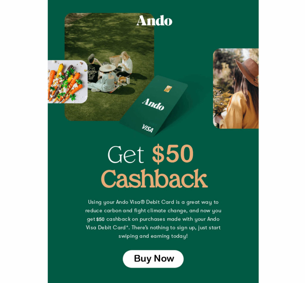
The first element is the header – a brand logo with a subtle image to represent the brand. The next thing is the types of offers.
If a customer purchases with an Ando debit card, he/she can avail of a $50 cashback. Under the big Title Copy, they describe the offer’s details and then add a CTA.
The whole email works step by step like a strategical process to motivate the user to click on the CTA, “Buy Now.”
7. Use eye-catchy and relevant visuals in your email
Using attractive images or videos makes an email communicative. According to Hubspot, “50% of marketers leverage video in their marketing strategy, followed closely by images at 47%.”
You should utilize relevant images or videos in email. Also, GIFIs in email are a good way to add some interactive elements to give customers fun relief.
However, image-only emails have fewer possibilities to engage recipients for many reasons. One of the top reasons is images could be blocked or filtered by the recipient mail server, if that happens all your efforts may go in vain.
So, the best practice is to use visuals to engage customers with your offer and convert them with the right email copy.
8. Craft email copy that works
Email copy is an integral part of email marketing. They go hand-in-hand. You must create visuals to support your email copy, and it’s necessary to craft email copy that helps to accomplish the goals.
Copy length, language pattern, and tone should be scrutinized before implementing them in your emails.
Here are some must-have email copy characteristics to follow –
- Understanding your audience
- Be careful to write the best subject lines
- Use a direct and personal tone
- Avoid industry jargon
- Show your brand personality while writing email copy
Whatever you write, make it a highly personalized experience for your audience, and incorporate your vision and goal. That’s how you can win over customers.
9. Utilize the beauty of Typography
Typography carries an underlying significance in every marketing message. It comprises the types of fonts, sizes, and colors.
The use of strategic typography helps you achieve the following –
- Signify a brand voice
- Assisting in the email design hierarchy
- Improve user experience
So, to improve your email typography, there are many ways like choosing the right fonts, and colors. The best solution would be following the industry’s best practices.
According to Unlayer, the 4 best email font families are – Sans Serif, Script, Serif, and Decorative.
Under these families, these are the 10 best email fonts you should utilize –
- Arial
- Verdana
- Georgia
- Helvetica
- Tahoma
- Times New Roman
- Open Sans
- Roboto
- Raleway
- Lato
Most of the time customers don’t even understand how they are motivated by the overall typography of an email. So, here’s how you have bigger possibilities to impress them with a smooth user experience.
10. Use image alt-text as a backup
Why use alt-text in email images? The answer is simple: whenever your images turn off, either by an internet speed issue or recipient server issue, alt-text will help your subscribers learn what the image is about.
The best solution is to use short but descriptive alt-text to the images. You can describe a brief line about your offer or the types of emails. No big deal, but very effective.
11. Optimize your emails for Dark Mode
Dark mode lets users see your emails in a dark color scheme. And, more than 34% of email recipients use dark mode while opening an email. (Litmus).
Though it left 74% of people who love the regular light mode, why don’t bring something special to those who like just the opposite?
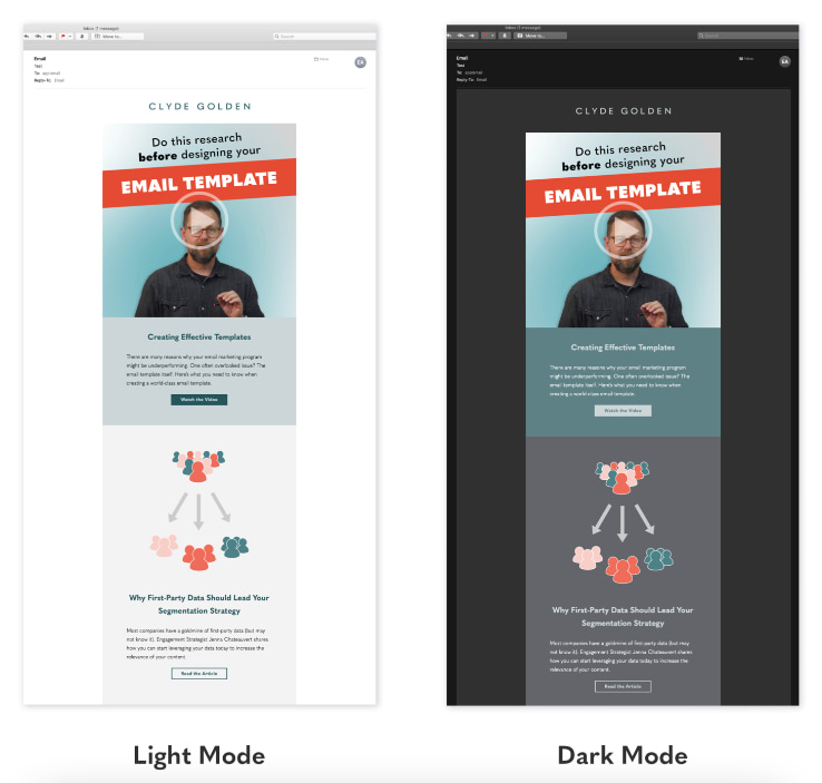
Dark mode needs no changes in the color, fonts, design, and size of your email. All you need to implement the option with some compatibilities, so when a subscriber uses the dark mode, the color of your email shall adjust to the situation.
The benefits of dark mode are mainly improving the user experience, decreasing eyestrain, and adding up to your email design aesthetics.
Final Thoughts
So, these are the email design best practices you should check and implement in your email marketing strategies.
The best way to get striking success with your email design is to follow the industry trends, and never stop looking for innovation.