How to Increase Your Open Rate With Email Preheader Best Practices

Before you get started with email preheaders, let’s rewind a common teenage scenario. Once upon a midnight, you are off to get some snacks. Your mother is not home, and you barely know what’s out there in the kitchen to crack something. So, can you find a cookie jar that is not transparent?
The best way is to search for the label on the kitchen jars (thanks to your mother). Pickles, flowers, coffee, peppers, and yes, there is a tin jar just around the corner that has labeled with a delicious word – cookies. Ta-Da!
Email preheaders work similarly. After the subject lines of your email, the preheader text shortly describes the content of your email. It helps the reader to get a clear idea of what’s in the tin jar. You can tell subscribers that you are selling cookies, or let them know these are the last pieces of cookies made from exotic ingredients.
Hence, our premise is to help you increase your email open rate with the right email preheader best practices. The more smartly and strategically you utilize email preheader text, the more open rate you can avail. Alas! unlike the email subject lines, preheader text is often understated. That shouldn’t be the case. Then what should be? We will show you step by step.
What is an Email Preheader – a Short Note
It’s always good to revise the basics. Email preheaders aka preview text are texts you see just after the email subject lines in your inbox. They are designed to give you an idea about the email content or make you intrigued to open the email in the first place. Here’s the most common example, take a look –

We’ve marked two email preheaders from the Economist and the New Yorker. The first one is about Cyber Monday Sales. Look what they did. Before you open their email, it is clear that a 50% discount is available. As for the next one, the New Yorker is letting you know what extra exclusive piece of writing you get as a regular newsletter subscriber.
It means email preheader texts are some sort of guiding your email audience, giving them a clear reason to open your emails. Hence, the more strategically you go for it, the more help your subscriber would get, so does your open rate.
How Much Long it Should Be – the Ideal Length of Email Preheaders

Is there any ideal length for your email preheader text? Yes, there is. The main consideration here is visibility. You can write long preheader texts of up to 250 characters. But we would recommend shortening it and keeping it under 90 characters for two reasons.
One, for the sake of complete visibility of your preheader texts. Two, the compactness and a to-the-point description are a necessity. Therefore, the average preheader length of an email ranged between 60 to 90 characters.
Out of a lot of distractions, our attention span is decreasing on a significant level. It was 12 seconds earlier in 2000. According to a current study, a full-grown human attention span is less than 8 seconds which is lesser than even a goldfish. Given that data in mind, on average, we don’t see much when we look. We just scan through things.
As for writing email copy, or email preheader text, you must consider the fact, the email readers give you only a few seconds and you must do your things right before they move on to the next email.
Another fact you can’t deny, the mobile users. The average email preheader length for the iOS mobile version is 30 characters, on the other hand, Gmail users would see only 24 characters.
So you must A/B test, consider all the average numbers and make a decision for your email preheaders length.
Email Preheaders Best Practices to Gear Up Your Email Open Rates
Best practices are what make your process more improved, flawless, and successful. According to our own experience of sending email campaigns, and research throughout the industry, we’ve found out a handful of email preheader best practices that can help you to get the most out of your email marketing. Keep reading.
1. Complement Your Subject Line with Email Preheader
47% of email recipients open an email based on the subject line alone. Whereas, 69% of email recipients report email as spam based solely on the subject line.
Subject lines are the key to increasing your open rate. Preheader text could be an integral part of it. The more relevant and powerful it will, your chances intensify. So when you write down the email subject line, try to align your preview or preheader text with it.
Take a look at the subject lines below –
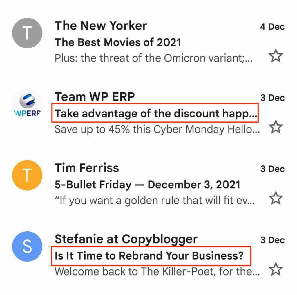
WPERP was giving discounts. So the preheader text just elaborates the types of offers specifically. That is a good example of complementing your subject line with the preheader text.
On the other hand, the email from Copyblogger isn’t helping like the WPERP email. They are sharing some tips and courses on rebranding your business, and the preheader tells you nothing specific. Though the word “killer-poet” is somewhat intriguing, and it can impact the open rate on a positive note for the sake of power copy.
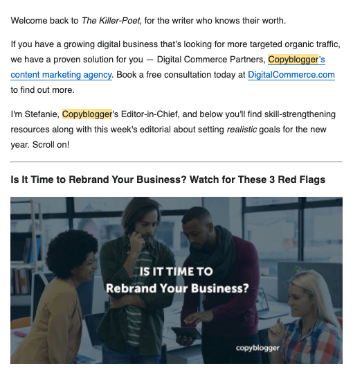
The email body copy shows that the Killer-Poet is a program specially designed for copywriters to write better copies and win their prospects.
However, one point is clear here, these types of preheaders are auto-generated. If you don’t write your preview texts, your email service provider automatically chooses some words from the beginning of your email body copy. No offense to Copy Blogger (one of my favorite sites btw), this practice is not suggested.
As email subject lines are the most crucial factor to increase open rate, your preheader text best practices should include subject line analysis.
2. Build Curiosity and Not Summarize
Email preheader texts are helpful to make your email audience curious. Missing that chance would be a mistake. B2C writer Gregg Feret once told, “making customers drink is not your job. Your job is to make them thirsty! When they are thirsty they will drink.”
This thirst is what can be called curiosity. You must build it to make the customer intrigued and open your email. Here are two of the best ways to build curiosity –
- Reveal less, but reveal the most interesting piece of information
- Give your email reader a glimpse of the value of your email

If you look at the above example, you can see how smartly the Economist newsletter builds curiosity with the word “unmissable.” Where FATJOE was sharing 10 SEO tips to improve search traffic. Both of the email preheaders maintain the thumb rule – they build curiosity with striking information and power word, they share a glimpse of their value.
However, once mistake you should avoid. Don’t summarize the email content in your preview text. The best practice here is to utilize the section to improve your user experience and overall open rate.
3. Use CTA in Your Email Preheader Text
Now we are talking about one of the most crucial email preheader best practices. It’s CTA (Call to Action). CTAs are not only about buttons. You can write something to make someone do something. Though, most businesses underestimate this and focus on summarizing email content or juggling words.
However, CTAs work best when you want your email reader to purchase something, subscribe, give reviews, or take any type of action following your email. Here’s what the New York times do –

After offering the special prize, New York Times use the preheader texts as a call to action. Nontheless this can improve their open rate than usual promotional emails. CTAs always work if put with a strategic plan. Data is also telling us that emails having a single call-to-action can increase click rate up to 371%. According to HubSpot, personalized “call to Action” convert 42% more leads than untargeted CTAs.
4. Personalize and Use Your Subscribers Name
Campaign Monitor found that personalization in email marketing can drive your open rate like crazy and revenue growth up to 760%. When you address your subscriber by their names, they feel more connected and think that the email is tailor-made only for them. This is the secret.
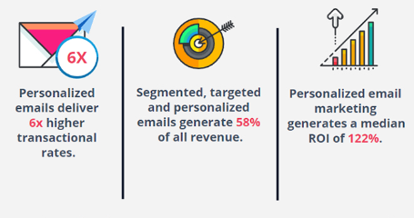
Out of thousands of emails, why should an email reader open your email? Usually, they go for the ones that use their names in the email preheader text. Hence, you can follow this best practice to improve your open rate too. You can’t use the subscriber’s name in every email sent. But it is possible to consider this best practice in relevant emails and tailored offers based on specific customer behavior and action.
5. Numbers Can Intensify Your Preview Text
Using numbers is a common email preheader best practice. Most of the companies show the discounts in numbers, creating FOMO by using the deadline. Though what works most is the relevancy. Numbers work when you put them strategically.
People love to be guided by numbers. Here are some core reasons –
- Numbers work as a promise to get something specific
- Helps people with a feeling that they are learning something
- Numbers help your audience to stick to the point

If you look at the subject line, the numbers play a big role. Hence, it could be a good practice to elaborate your number game in the email preheaders.
Closing Up
Before closing up we want to tell you one last thing – be on par with the trends and be innovative. When you have these two tendencies in your sleeves, following the aforementioned preheader best practices will do the rest. However, here are some other things you may love to consider while composing your email preheader text –
- Using emojis
- Ask questions to involve readers
- Use detailed preheaders sometimes
Well, there is another thing, A/B test your email preheaders. Never stops testing. The more you test, the more you improve – that is the golden rule.


