10 Email Popup Examples to Grow Your List Like Crazy (with Expert Tips)
Do you want to build an email list full of targeted customers? Customized email popups will help you convert more visitors into subscribers who are really interested in your brand. And with these real prospects, you’ll be able to conduct a successful email campaign.
OK, we know what you’re thinking.
“Show me if there is any proof”, right?
- OptinMonster reported that Fastrack recovers 53% of their abandoning visitors using a Promo Code email popup
- Flywheel noticed 660% more impressions than before and converted 4.7% of their targeted users.
Whether you’ve already published your popups or looking for new ideas, you are in the right place. This blog shows you 8 real-life Email Popup Examples from leading brands to inspire your own. You also get actionable tips for optimizing your popup with essential elements.
If you love to jump sections –
- Email Popup Definition
- Benefits of Using Email Popups
- Types of Email Popups
- 10 Email Popup Examples to Inspire Yours
- 5 Expert Tips to Design Your Poups Like a Pro
What Is an Email Popup?

An Email popup is a small window that appears on a website visitor’s screen based on pre-defined conditions or rules. It usually comes with special offers, important information, or just a simple lead collection form.
You are often offered a freebie or discount in exchange for your email address. Mostly it blurs the background webpage and you can’t move unless you follow the instructions or press the cross button.
Now, you might think it’s annoying and hamper your user’s experience on your website.
But the truth is:
If you can use it in the right way you can witness an impact on your bottom line. It’s however more impactful to explode your email list.
Reliablesoft.net noticed an immense boost of more than 300% in their conversion rate after displaying an exit-intent popup on their website.
Here is a simple email popup example from weMail–
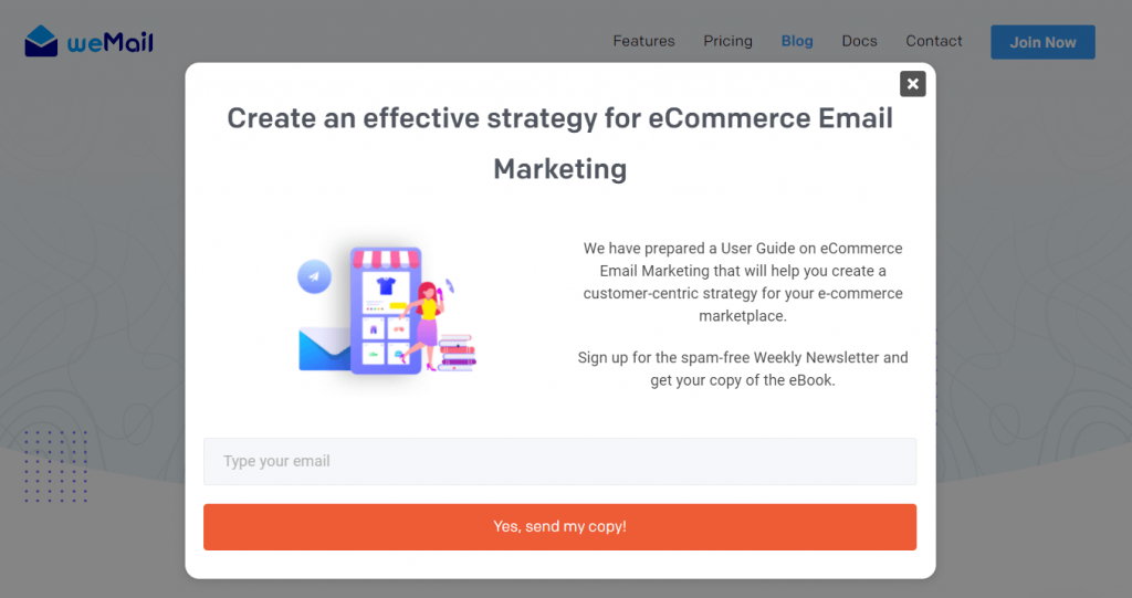
Simply put, this popup includes an attractive heading, an interactive image, a clear description of benefits, a colorful call-to-action button, and only one text field to fill up. It helps visitors quickly understand things and increases the possibility to enroll.
Benefits of Using Email Popups

For years, email marketing has been one of the top choices for marketers to reach the target audience. In fact, Hubspot recently reported that 78% of marketers have seen a significant increase in email engagement over the past year. Whereas McKinsey claims that email is 40 times more effective than common social media marketing channels like Facebook and Twitter.
The thing you need to perform first for effective email marketing is an authentic email list.
Why?
Because, the more real subscribers you have, the more positive conversions you’re going to have as a result. Optimize email popup gives you the chance to grow your email list with related prospects.
Apart from this, you’ll get great advantages of-
1. Grab the Quick Attention of Visitors
Every visitor has a unique taste. So how do you cater to them all?
- You can target them with personalized popups based on how they behave on your site.
- Welcome your first-time visitors with some great incentives.
- Greet repeat visitors with unique offers, sales campaigns, and personalized recommendations.
- And send your loyal customers with personal popups.
These are effective ways to drive people’s attention at different levels on your site.
2. Spread Brand Awareness
Pop-ups give you an opportunity to present your brand in different ways in front of your audience. Thus, it helps you in self-branding. But you should not annoy them with email blasts. In case you might be asking yourself, you should approach them with a new and important message.
3. Opportunity for Great ROI
You do not need to spend much money or time to set up email pop-ups. But for many websites, it improves up to 600% of their regular subscription. So, whatever the new sale is actually an overplus for the investment. Again, you can use the email list for email marketing and promoting the website.
4. Encourage Customer Sharing

It would help if you also designed your popups as attractive as possible before showing them to your visitors.
Here’s why –
Attractive-looking popups have a high chance of getting shared by visitors with their peers. Thus, you can make your subscribers advocate for your brand and business building. It is an opportunity to make things viral free of cost.
5. Future Email Marketing Strategy
You can check the response to your popups, CTA, retention time, etc. by using analytical tools. It makes you understand the type of individual subscribers and their needs. So, you can plan your future email marketing strategy to secure ultimate effectiveness.
Are you planning to start a membership website? Check these ideas to make your Membership Level Names engaging and stand out.
Different Types of Email Popups
There are several types of email popups such as Exist-intent, Cart Abandonment, Special day discount, Sales Promotion, Countdown Timer, and others.
- Exit Intent: This pop-up appears when a visitor intends to exit. It often contains lucrative deals that bound the audience to stick to the site.
- Cart Abandonment: This appears mostly in the eCommerce site when a visitor leaves the site after adding items to the cart but does not finish the process. It helps the site owners to send reminder emails to the visitors.
- Countdown Timer: This pop-up comes as a reminder of any upcoming special event to create urgency. It often comes with amazing deals that people may rarely avoid.
- Special Day Discount: This pop-up comes on or a few days before a special day, like Christmas, Black Friday, etc. Often these are outstanding deals offered by a company. Many times, people wait for a year to grab it.
- Lead Magnet: Most newbies and professional bloggers use this pop-up to capture subscribers. They offer informative newsletters, eBooks, infographics, and Excel files, or present popular products to the subscribers. Once you subscribe the piece of content will go to your email address.
- Coupon Code/ Discount Code: Often websites have a special area for this pop-up. Various amount of discount appears once the visitors get the coupon or discount code.
10 Email Popup Examples to Help You Grow a Robust Email List
Below you’ll get 8 examples of email popups from top brands. Whether you’ve already designed your popups or just planning to start, check them for some great inspiration.
Let’s jump in!
1. Gaiam.com
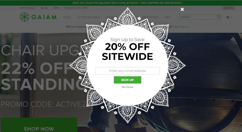
The unusual shape of the popup is attractive enough to instantly grab visitors’ attention. This design also goes very well with the brand’s visual aesthetic. They made the appearance unique but kept the lead collection process simple. A prospect can easily sign up by just inserting his/her email address. Also, it’s offering a great discount of 20% that customers would never want to miss out on.
2. MemberMouse
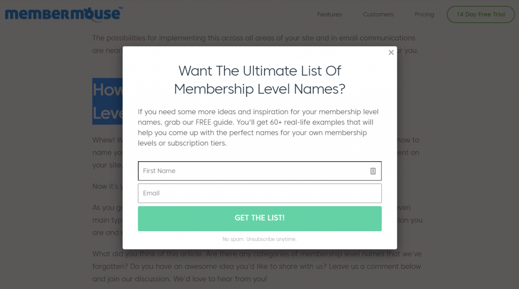
This Membership Platform keeps their email popup extremely relevant to their visitors’ interest. A simple background color and an eye-catching CTA button make the design interactive for visitors. Moreover, the tempting offer of a “FREE guide” makes readers quickly ready to respond to the form. Offering new visitors essential incentives is always an effective list-building strategy.
3. ZOOSHOO
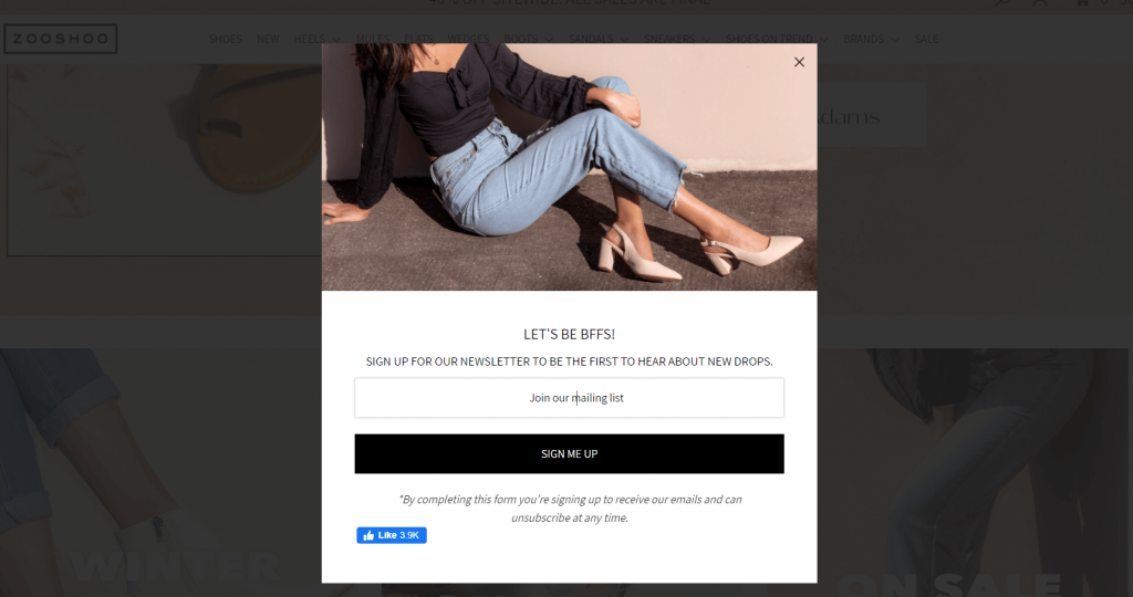
It’s a popular eCommerce site for branded shoes. They made their email popup considering their customers’ preferences. At first, the picture of the model focusing on her shoes will boost your interest in adding new members to your closet. Then the title “LET’S BE BFFS” personalizes your presence giving a special feeling. Moreover, a fashionable woman would not miss the updates of the new collection at any cost. She therefore quickly enrolled herself on the email list. Don’t miss the color contrast they use over the popup. The dress code of the model and the color of the CTA button complement each other so well. Finally, placing the FB button with current likings is another smart move. It works as social proof of the brand’s popularity.
4. Tim.blog
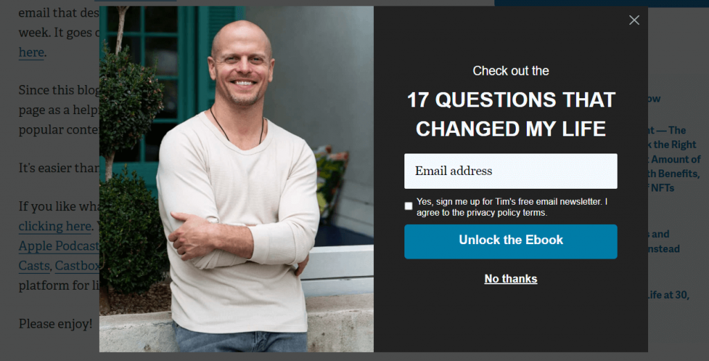
The large smiley image of Tim Ferriss is the most prominent feature of this email popup. This is a two-step popup window. The first one gets your concern whether you are interested or not. And the second one brings you the option to Sign Up. Here you also find a check box asking for your permission and letting you know about the policies. The entire process helps visitors feel secure in sharing personal information. Besides, it’ll appear when someone intends to exist from the site. The opportunity of having an exclusive Ebook in exchange for an email address may seem profitable to everyone. It holds them back to the site as well.
5. Varley.com
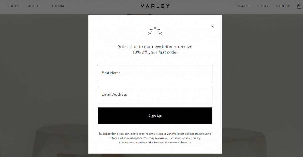
Varley has a very basic theme-based email popup. They keep it back & white which aligns with their website color. The main attraction of their popup is the alluring offer of 10% off for the first order. It may even convince many reluctant customers to join the subscription list. Perhaps, this simple yet elegant design might work exclusively to grow their email list remarkably.
6. MarketingProfs
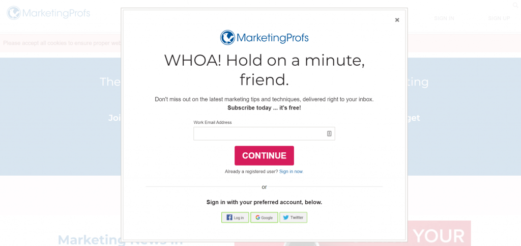
This email popup is perfectly in line with the brand’s visual style. It appears when a visitor is about to leave the site. An attractive title mentioning the visitor as a friend will bind you to read the message. The smart color combination of logo, title, and CTA button drags possible customers’ attention to the core points of the pop-up. Here, people will find easy options for social sharing at the bottom of the window.
7. Membership Geeks
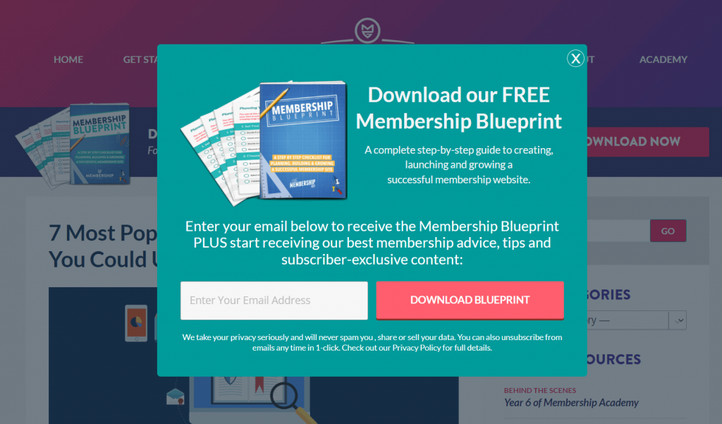
This is another example of a classic lead magnet. Membership Geeks offers new subscribers a free eBook that’ll create value for their site visitors. Therefore it’ll be an easy yet profitable deal for both parties. The attractive visualization of the book and attention-grabbing color contrast between the background and the CTA button makes the entire presentation appealing. Nonetheless, they give the last strike ensuring subscriber privacy with a clear statement at the bottom.
8. Sleeknote
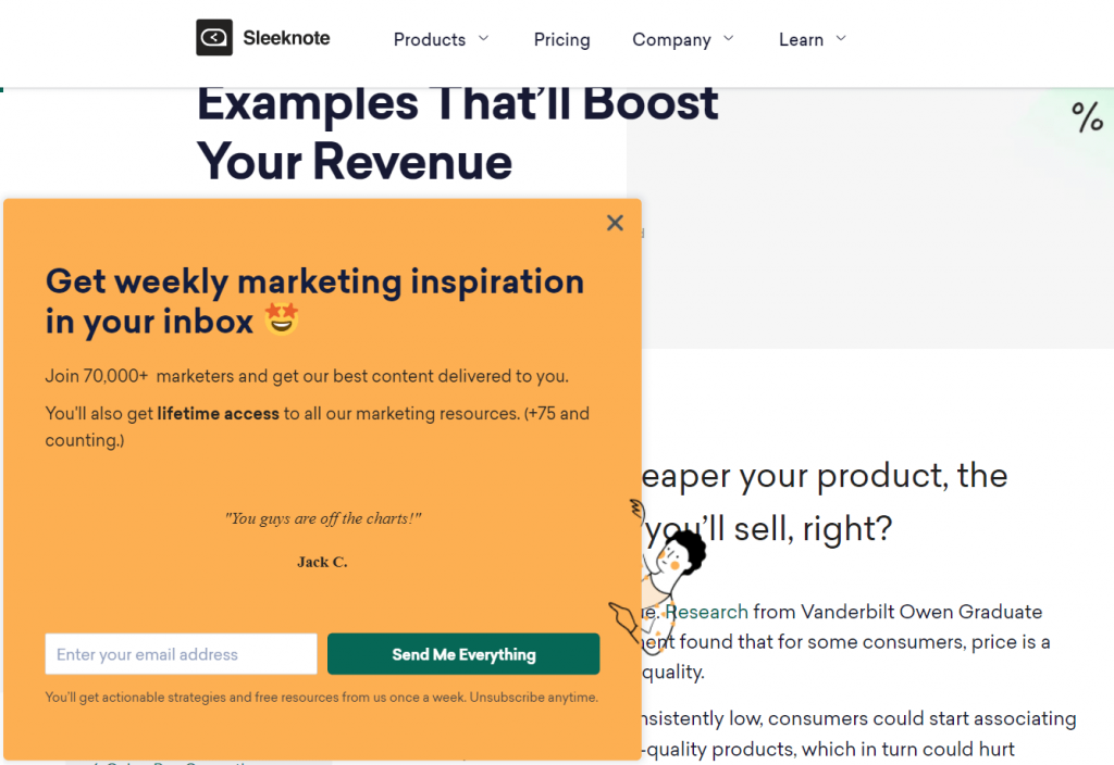
Sleeknote offers you a great deal through their sidebar popup. This popup will appear on your screen from the bottom left corner while browsing their website. They include the number of marketers that exist in their list thus you feel a hurry to join the list. Minimal use of text box, colorful button, and right emoji, all together makes the popup engaging and encourages more people to sign up.
If you are a beginner learn- How To Create Engaging Popups With Elementor That Convert.
You can also use WordPress popup plugins for displaying special offers or greeting your would-be customers with some motivation.
9. Framebridge
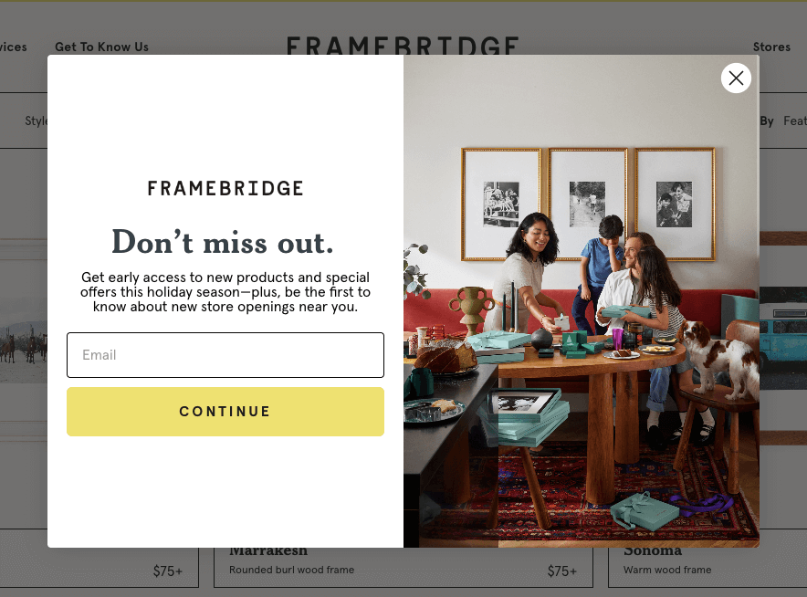
The most intriguing part of this Framebridge sign up popup is its well-aligned theme of the brand. The shop is a seller of artistic frames with a touch of modernity. The website is designed and evoke a posh and cozy aura when you visit there. So does the introductory popup.
What do we love most?
- The contrasting design combined a luscious product image and sign-up form
- Minimalistic FOMO effect in the copy
- Addressing new subscribers as early birds and promising to give more
- You only need to give a little information, they use the art of shortness
What to learn from this kind of sign-up popup example and how to own something like that?
Well, you can tweak the CTA copy and put more creativity into it, there’s still many possibilities there rather than using a simple copy like continue.
10. Partake Foods
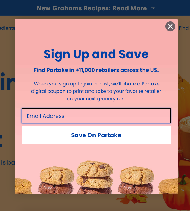
Partake Foods is a shop just like a popular food place should be. It is an online food seller that specializes in cookies, breakfast meals, snacks, etc. It does offer allergy-friendly foods with organic color and other health-concerned ingredients.
Following different festive seasons, Partake changed its theme color as well as food design. It becomes a norm. And, what made us choose their pop-up for email sign-up?
- A pretty good offer of coupons which is a good example of coupon marketing too
- A very palatable or attractive design like yummy, don’t you think?
- Promote their 11+ product retailers around the U.S.
- A powerful CTA Copy
What should be the takeaway?
When you want a visitor to become a willing subscriber, try to convince them you are up to serving their need so well, plus you have a heartfelt intention to keep your promise. It could be an incentive, it could be creating a feeling that you care. We think all of these emotions sum up in the above email popup example.
5 Key Tips to Design Your Email Popups Effectively
Many of us think popups are annoying.
It is true.
But only if you design it with the wrong elements. Your popups should be small and not cause trouble accessing the website content. In short, it should not hurt the user experience.
In 2016, Google announced that it would penalize sites that use intrusive interstitials on mobile due to the limited screen space.
But that’s just one side of the story.
In fact, the popup still works great. If you know how to make them desirable. Since the Google announcement, many websites prefer slide-in popups that will come from the left or right of the screen, and keep their content still accessible to the visitor. However, you can also restrict the popups for mobile users so they can enjoy a smooth website navigation experience.
Some other email popup good practices may include-

1. Use Attractive Visuals
Respond to images and videos are incomparable with text.
Wondering why…?
People are even 400% more likely to catch up with the image and it’s 1200% for video.
It is always best to choose a picture that suits the website. Make your popup more engaging using relative visuals like images, gifs, videos, etc. For example, consumers prefer discount pop up in floating, restaurant sites pop up with food images, etc. In addition, a well-designed CTA button increases the click-through and activates your sales funnel immediately.
2. Limit Input Field
Customers are always in a rush. If you stop them from filling up a boring long form, it may hurt their user experience. As a result, you’ll end up with lower conversions and higher bounce rates.
However, the main objective of the email popup is to collect email addresses. The wise decision would be to ask only for the most required information from your users. Most of the websites now include only one text field just for the email address. Some may ask for other important information depending on marketing strategy like age, sex, interest, etc.
3. Write Better Copy
A well-written copy can leave a long-lasting impact on people’s minds. Therefore, you should design your email popup with a compelling copy. No wonder, it encourages readers to take action in their desired way.
Throughout your pop-up copywriting visitors can quickly identify your brand voice, style, and usability. Right words let you greet your visitors with an amazing welcome note or great deals. So, you can manage expectations effectively and create a strong first impression on the people who land on your website for the first time.
4. Offer An Incentive
You can also offer special discounts to your new customers or existing customers for their advocacy.
Here’s why:
Popups with useful incentives always attract visitors adding great value.
People always love to get rewards from top brands. It boosts their loyalty and increases the chance to continue with the brand. In your eCommerce site popup, offer a percentage of discount on the purchase. For a blog site, you can ask for an email address in exchange for effective resources like eBooks, research articles, access to premium content, etc.
5. Proper Timing
You can’t just randomly pick any time to display your popup. If you want to improve popup conversions you must maintain a proper strategy in timing.
Wonder what are those?
In order to identify the best time to display popups, you need to consider popup types, average time visitors spend on your site, target visitor behavior, and others. Categorize your visitors and design personalized popups for each group of people. After summing up all the facts set the popup exactly at a time when a visitor is ready to see your offer.
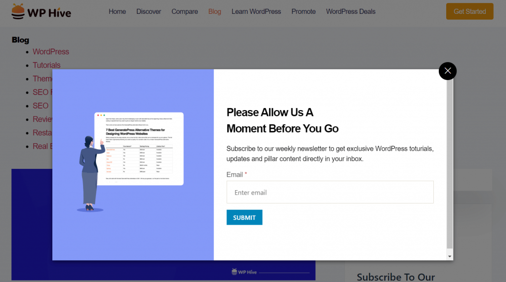
Here is a perfect example from WP Hive. They optimized their popup with great design, an animated gif, a simple text field, a focused CTA button, great rewards, and engaging copy. Also, it allows you to scroll the webpage without closing the popup.
Grow Your Email List with Optimized Email Popup Designs
An effective email popup is the best way to grow your subscriber list faster. Think strategically in order to build and launch pop-ups that drive more conversions. The above email popup examples will help you generate ideas that align with your brand.




3Comments
Pingback: MailPoet vs MailChimp for Email Marketing in WordPress
check365
These popup examples are gold! Love how you highlighted the psychology behind incentives and minimalist designs. The ‘timing’ tip is so underrated—showing popups after engagement avoids frustration. Bookmarking this for our next A/B test—thanks for the actionable inspo!
Tanvir Faisal Editorial Staff
Thanks for your appreciation.
Follow our blog for more insightful articles.