How to Design a Winning Email Newsletter Header with Examples and Best Practices
Your inbox receives tons of email newsletters every day. It’s good for you (not for everyone concerned though) to open a few of them. But you attract (most likely click) only to those that give a solid first impression. So, what makes a newsletter’s first impression after they got opened? Obviously, it’s the newsletter header design.
Well, first impressions play a big role in customer acquisition. 13% of people would love to pay even 50% higher for a product if it creates a positive vibe at first sight. Email headers are no different in this regard.
So, what are you going to get from this blog? Almost everything about newsletter header design. After reading it, you may well understand why they are so important in email marketing, and how to design such engaging and attractive headers to convert people who open your emails.
What is an Email Newsletter Header – Definition and Examples
Technically, an email header is a section above the email body content where you put quintessential information like sender, recipient, subject line, and other additional things like the email’s route to get to the recipient’s inbox and necessarry authentication data, etc. To be more specific, an email header is a code snippet in an HTML email above the body of every email content.
Likewise, an email newsletter header is the top part of any email newsletter where you can see the sender’s logo, image, and other personalized information. However, you can call the image of your newsletter on top a newsletter header.
For example, take a look at the following image –
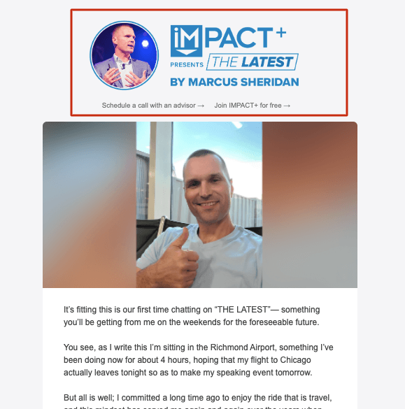
It’s a newsletter from IMPACT. The newsletter header section includes the logo and name of the sender (who is happened to be the author and influencer Marcus Sheridan). So while you are reading it, you can see the branding and even two links for conversion. One for scheduling a call with an advisor, and the other for joining IMPACT.
How to Create Newsletter Header that Works
The best way to create a winning newsletter header is to understand how it works and why it is important. We’ve pointed out one major reason at the beginning of this blog. Besides making an effective first impression, a converting header can also increase your brand value and even click-through rate (Well, this depends on several factors, please look at the example we’ve shown above, again).
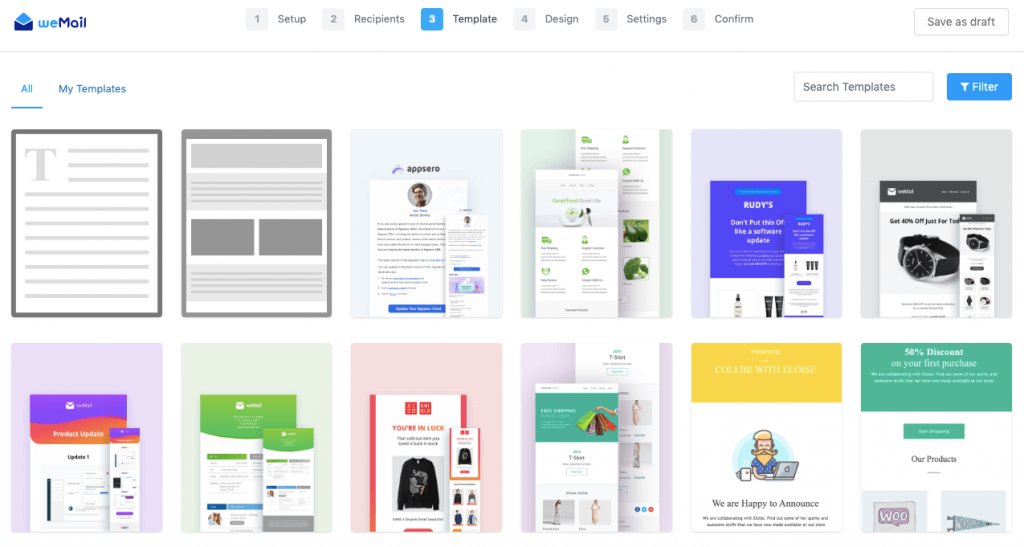
Any feature-rich email marketing platforms let you design your newsletter header from scratch. For example, weMail has a ready newsletter template library full of beautiful templates. They are highly customizable and you can design the headers any way you want with a simple drag and drop option.
Usually, most newsletter headers you may find have only a logo or brand name. To make it more converting, images can give you more. As victorian illustrator Frederick Barnard once said this famous quote –
‘A picture tells a thousand words’
Using a relevant image could be a game-changer for your newsletter header design (we will be giving some examples as you keep reading further). Therefore, you can add CTA’s or a clickable link, and even can choose a minimalistic approach too. Though, you must follow the best practices, and keep a consistent, clutter-free outlook to make your appearance strong than the competitors.
Best Practices for Newsletter Header Design
Proper guidance is what you need for any accomplishment. Here we’ve sorted out some tips or best practices that can help you create winning newsletter headers.
1. Don’t forget to Insert Your Logo
A logo reflects your brand valo. Whenever subscribers open your mail, a stunning logo makes a good vibe before they would start reading the content.
Using a brand logo in the email header surely is the most popular practice, but that doesn’t mean it is becoming less relevant or has a low impact. A brand logo in the email header remains powerful as ever it was. So, you must learn where to put it and with a style.
2. Using Visuals Can be Rewarding
Besides the logo, you can try on a thought-provoking image in the email header. It should have a connection to your brand and have an alluring quality to represent your campaign goal. Evidently, an image works faster than text in our minds.
80% of people remember what they see, 10% of them remember the same information they have heard, whereas 20% of them remember that information who read it.
MovableInk
Using original images is highly suggested. You can also take help from your design teams. However, if you don’t want to do that, there are a handful of websites (like Pexels, Freerange Stock, Free Pic, or Pixabay) where you can avail yourself of thousands of relevant photographs and illustrations.
3. Be Creative Regarding Your Email Header Image
It’s a wise thing not to use a raw photograph that you’ve just downloaded from the internet. You can put some creativity and significance here by editing the image and using it to tell your story. As you may find photographs that have a catch to represent your company or campaign but making them your own will be more fitting and original.
To do this job, there are applications like Canva, Pixlr, Visme, etc, along with the expert tools like Adobe Express, Lightroom, and Photoshop.

4. Keep it Clean and Clutter-free
Now here’s the part about being cautious. Images are extremely powerful in email marketing, indeed, but only when they are relevant. In addition to relevancy, your image should be clean. Being clumsy or noisy in the newsletter header design can annoy a subscriber and the rest of your email would be accomplishing nothing.
Take a look at the header of this newsletter below –
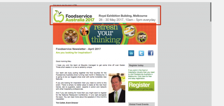
It has a brand logo, company name, detailed address, etc, even with a banner. These many elements make things only noisy. It’s better to be clean and attractive at the same time and avoid clutter.
Here’s another example of a newsletter header design that is clean, attractive, and aligned with the brand –
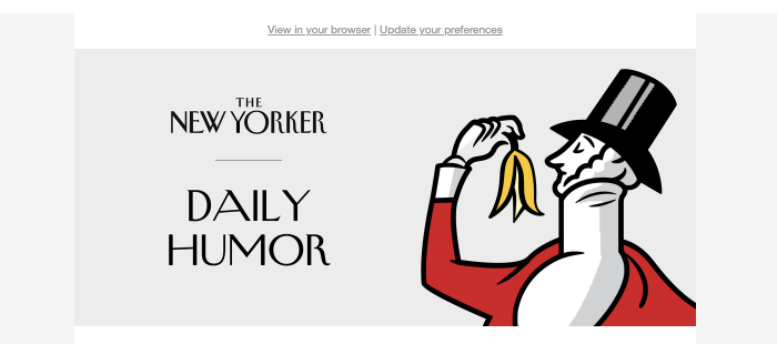
5. Adding Minimalistic Actionable Link
The header is a tricky section of your email body. It plays a significant role, and you only have a few cards to win the game. Along with the image or email header text you choose, there is a way you can invite people to make one or several actions. Here’s an example you can analyze –
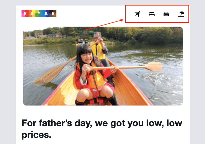
Kayak added the category sign (marked in the red box) besides their logo and a highly relevant image. Each of those signed is clickable and can take a user to a destined landing page. Without creating any noise in the UI, this newsletter header can do the job even if the reader doesn’t want to scroll down.
6. Keep A/B Testing
Testing let you ascend to further level. The more you test, more improvement will come. So, you need to run A/B test continuously with your newsletter header.
As it is an integral process, you can keep testing within the overall newsletter design. Therefore, keep experimenting and A/B test is enjoyable if you love to design. With weMail, you can easily do the necessary tests and see previews with its dynamic newsletter customize features.
7. Consistency Gonna Let You Build a Brand Voice
It is better to find out a cool and communicative newsletter header design before start sending your email campaigns. Because, a consistent outlook slowly builds your brand. So, after choosing a brand header, it wouldn’t be a good practice to make changes. However, you can select multiple design with a similarity to the core. And whenever you need a change, do it gradually. Hence, if you maintain this strategic consistency, you will be able to create a strong band voice.
Email Header Design Examples – Where to Begin
OK, we believe you’ve already got the basic and comprehend the process how to design email newsletter headers. The next thing you need to examine the best designs throughout the web, get inspiration, rationalize the reason of the success or failures, and getting started. To help you with that, we’ve gathered some of the remarkable email header design below. Check them out –
1. Roman Got it Simple and Synced
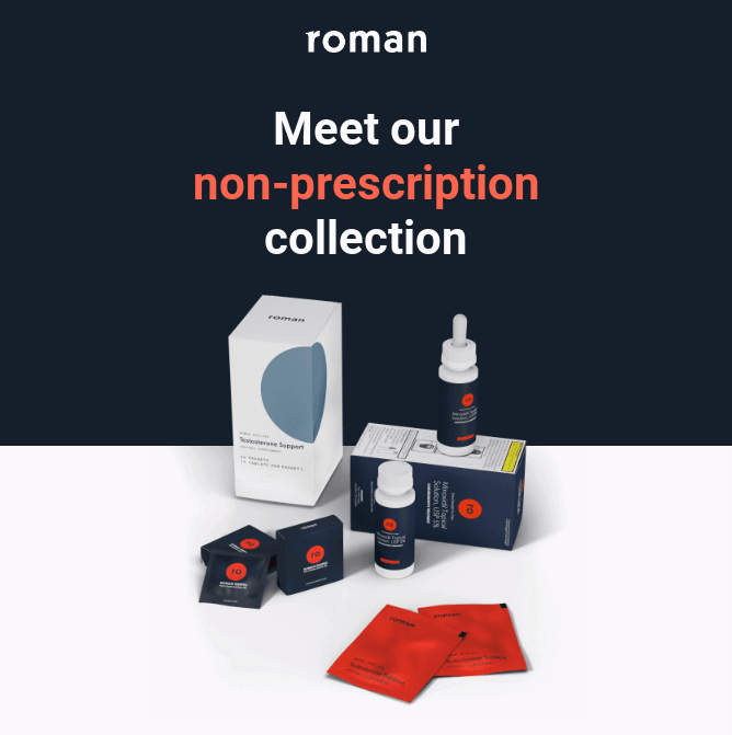
In regard of clean design, and building interest, the above newsletter header design is powerful. It has the brand logo, have a precise copy, and eye soothing relevant image that is well-synced.
2. ONYX Coffee Lab Nailed it with Logo and Letter
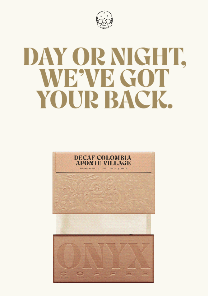
A minimalistic logo, that is so powerful, and a choice of beautiful lettering. Behind a low-key soft background totally playing the music. The above Onyx newsletter have one of the soothing header to learn from.
To follow this design, you need to thing of the template as a whole, so the alignment wont hamper and the newsletter header don’t fail to keep up with the overall tempo.
3. Life Elements Calls For Some Action
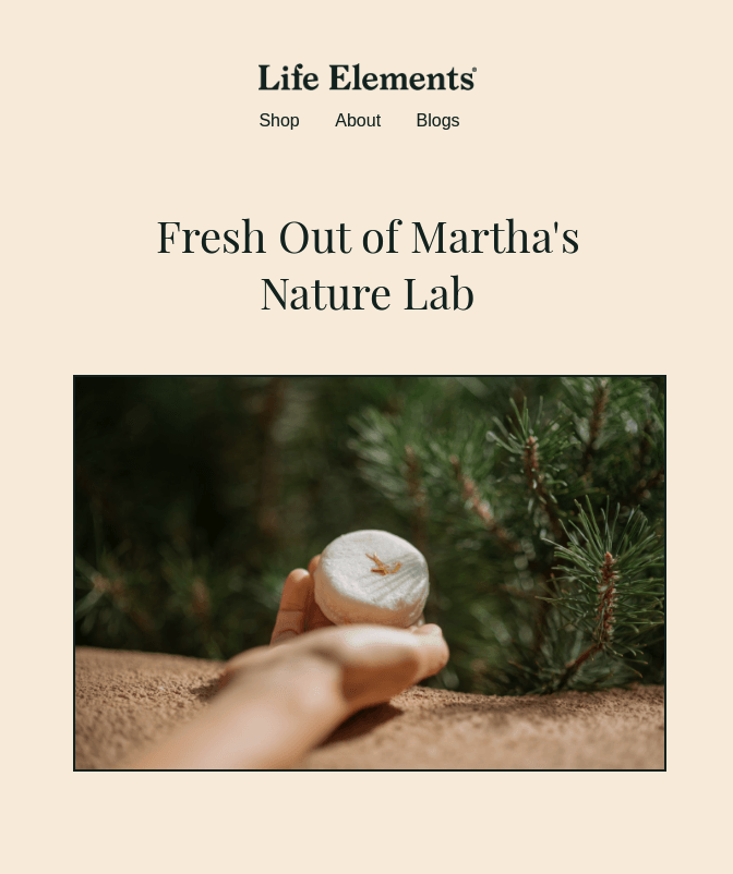
What about it? The simple trademark logo, and just below it you will see three call-to-action for Life Elements shopping page, about section, and blog page. As a visitor, whether page you visit, it will be a sureshot winner for the company.
The main reason this design work that it is eye-fresshenning and have zero chance to bother you most cases. It has a soft natural tone, and it does offer natural product. The whole newsletter design is superbly synchronized with the brand goal.
Closing Up on Email Newsletter Header Design
So, what do you think? Are your current or previous newsletter headers did worked that way it should? If yes, you are clearly ahead of your competitors. If not, now you have the knowledge to overcome your drawbacks.
Let’s get on with your design tool, best of email marketing copy and content, strategic offers , and the most fitting email marketing tools. And start sending email campaigns with perfect newsletter headers and body.


