7 Stunning Newsletter Sign Up Examples that Convert
Even in the wake of social media marketing, email remains the most powerful marketing channel to reach people with close personalized touches. Despite a lot of social media platforms surrounding you all day long, email works the most in regard to sales and building long-term business relationships.
However, everyone not getting the same results. Why is that? Here’s one of the core reasons you should look now. The biggest challenge of email marketing is collecting quality leads. If your email list is full of inactive people or who don’t want to hear from you, all of your efforts would go in vain. So, if you don’t take the necessary steps for collecting leads, it’s time to think twice.
Hence, the most effective way to get interested people into your email list is a newsletter sign-up form. It’s the very first step where you can impress people, let them know the benefits of signing up, and make them subscribe. You can put those forms as popups or floating bar, optin, and sticky bar in your landing pages. All you need is to learn and apply the best practices, find out the winning ways to use them.
Well, we’ve got you covered. You will find a handful of the most exciting newsletter sign-up examples in this blog. After examining them, you will be able to create such newsletter sign-ups that can increase your subscription rate superbly. Keep going.
Newsletter Sign Up at a Glannce

When we talk about newsletter signup, elwe’re referring to a process by which visitors elect to receive updates from an online business through email. By using an email newsletter signup form, visitors can enter their personal information and email address and hit subscribe.
Bigcommerce
The two big reasons you need newsletter sign up are –
One, it’s the primal way to expand your audience or prospects.
Two, you can build a sustainable relationship with potential customers. The journey begin with newsletter sign up form.
Hence, you can utilize newsletter sign up to familiarize possible customers with your business. Whenever a visitor land on your page, a popup or optin form help you to keep their information to reach them further for any marketing campaign.
Also, this is the way you can manufacture consent of your audience so that you can send them emails without any annoyance. Your newsletter sign up copy can be that much guiding and helpful so that the people understand and happily subscribe to your list.
10 Newsletter Idea to Boost Email Engagement & Engage Your Readers
7 Best Newsletter Sign Up Example to Inspire Yours
As an email marketing platform, we have also used different types of sign up form over time. Therefore, we’ve come through a lot of our clients and other websites who have successfully use the perfect sign up strategy to increase their subscriber numbers. However, from all of the newsletter sign up example have stumbled upon, here are the finest ones which are creative, effective, and successful.
1. Blogging Wizards is Showing Magic with Their Simple Newsletter Sign Up
Blogging Wizard is a content-based website directed by Marketing expert and blogger Adam Connel. He and his team share blogging tips and strategies in this website. If you are a writer and blogger, this site would be of great help nonetheless. Let’s look at this optin form. You can see it while visiting their website within a minute.
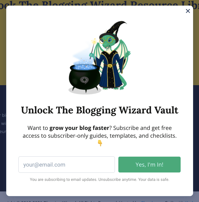
In this newsletter sign up example, simplicity is key. Let’s take four words that can work big time – grow your blog faster? Indeed, if you want to grow your blog, you can give your email, and click the green button. You will get specialized guides, blogging templates, and checklist to improve your skills.
What should you learn from this newsletter sign up example? Well, it has four parts, and all of them are interconnected.
One – The highly engaging brand cartoon. It works like a logo and reflects their branding.
Two – A copy that tells everything you will get if subscribe.
Three – The optin asking you only for an email address, nothing more.
Four – Blogging wizard make it clear that you are only subscribe for email updates. Your data is safe. And you can unsubscribe anytime.
What’s fun in there? Simplicity. While we are analyzing it, you can see it has many portions. But when you get it as an audience, it requires a single step to subscribe. Here’s the magic.
2. Kate Spade Saturday Emphasize on Color and Shape
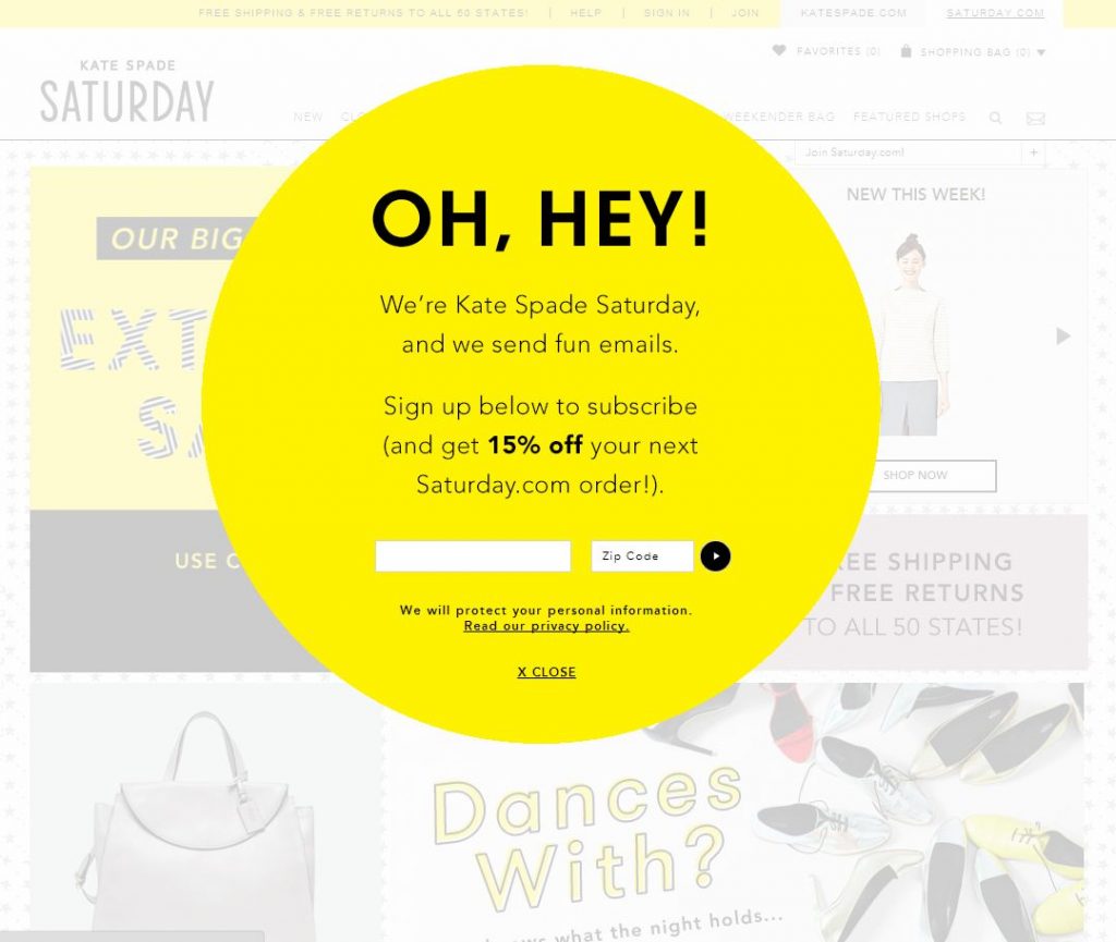
Kate Spade is a fashion brand. They work with style and trend. It is also shown in this beautiful newsletter sign up example. It is a common practice to choose a theme color for optin or popup. Hence, Kate Spade chooses a complete yellow background despite they have options for using white, ash, or blue.
According to author and public speaker Kendra Cherry, Yellow is a powerful color that has certain marketing qualities like – it is attention-grabbing, energetic, and worm.
Besides the successful use of color, you can see that this newsletter sign-up form is in a round shape while most of the other forms use squire or vertical shaped boxes.
So, the color and shape make this popup unique and attractive. Therefore, the body copy makes it even more effective.
3. Fun in the Copy for Really Good Emails
As an email marketing archive, Really Good Emails is soo good. They have a vast collection of real newsletter examples and demos. Either you are a marketer, or simply a email sender, this site is a treat to find out exciting emails top companies are sending everyday. So what is so special about this newsletter sign up example? Take a closer look.
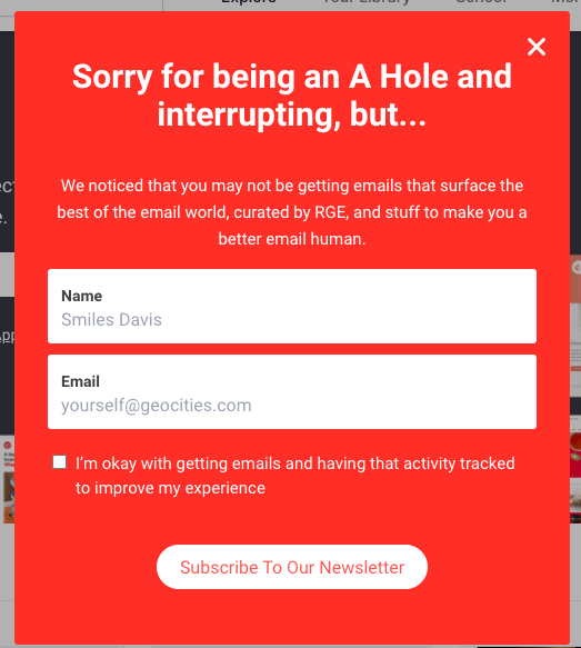
The main catch here is the title copy. As all the popups are bound to give users an interruption, Really Good Emails address this issue with a fun by calling themself an A-hole. This means what it means anyway. With a stunning red background and headline that is so much popping, most of the audience could be triggered to go further and subscribe.
Hence, what is their promise? According to their words, as a random visitor you may not are getting the best of the email examples, so here’s the deal – subscribe and get a curated collection based on your preferences to get delivered directly to your inbox.
Also learn how to create a discount coupon code for your website in holiday seasons
4. VOX Newsletter Sign Up Example – Offering Several Option
If you are a news channel, you certainly have several reader bases. Same goes for any shopping websites also. For example, you can be a book lover and love to get only the updates of the newest books. On the other hand, your brother could be a music lover. He would love to get updates about the latest music trends and instruments.
Vox is doing the same. Even most news portals or content-based websites have different newsletter options for their readers. Here are two different optin forms you can check out –
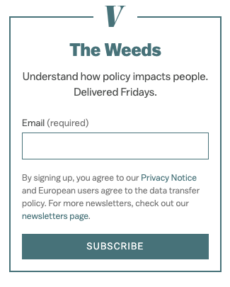
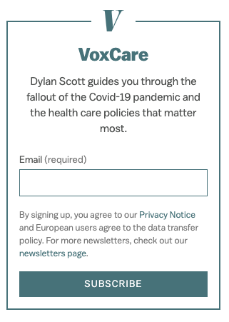
The first one is The Weeds. If you subscribe to this newsletter, you will get all the curated political analysis in your mailbox. The latter one is designed for healthcare issues, specially for Covid-19 awareness.
It is a proven way to make your audience feel special. Therefore, 36% of shoppers believe brands should give them a more personalized marketing experience while they are reluctant to share personal data. Hence this way, you can admit your audience to their preferred email list and get their email address and other relevant information at ease.
5. weMail is Doing it Under the Blog
weMail is a WordPress newsletter service provider. You can call it a dynamic email marketing platform for both WordPress and SaaS. With a beautiful form-building option and multiple sending API, this robust email marketing service is helping clients smoothly. What’s so special about one of weMail sign ups? Take a look at this newsletter sign up example –

Under every blog we publish (including this one), you can see a sign-up form like this which inspires our readers to go for a newsletter subscription. The results? It is working superbly. After a reader having good time with a blog happily want to subscribe, because that time he’s not in a hurry, and have a good impression about weMail. That leads the subscription number to go higher.
If you haven’t apply this hacks earlier, try this on. The results would be on your court.
6. How Boast is Doing it Right with Discounts
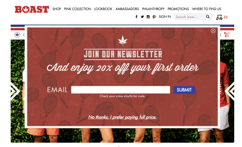
Shopping Brand Boast was showing this newsletter sign up form to increase their conversion and subscription rate. It is direct, colorful, and precise with offers which told customers to sign up for newsletters and get 20% discounts for the first purchase. The copy is powerful here, the combination of background and overall design makes it a stunning newsletter sign up example.
However, you can check their most recent approach to collect leads. If you go to Boasts landing page, you will see this slide in form. It contains just an image, and space to put your email address and that’s all.
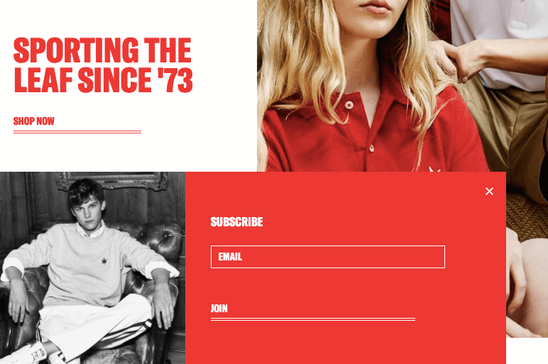
This types of newsletter sign-ups usually implemented by a site that has a stable audience and rich content library. Hence, it also make a new customer interested to hop in to your list because it can be work as a social proof that you are reliable. Sometimes less buzz can get you more attention. However, to reach specific goals, the first example of Boast is a better choice.
7. BBC Earth is Extraordinary and Full of Life
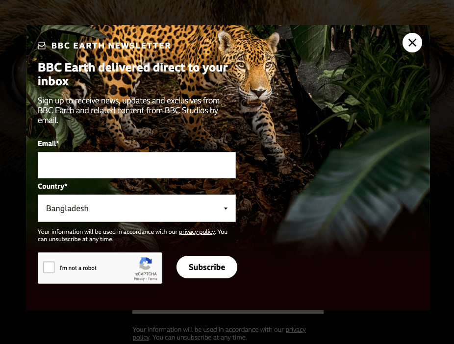
BBC Earth has dedicated a complete landing page for people to sign up for newsletters. Hence, when you get into that page and still not taking any action, they will show you a popup. And it looks so appealing. As showing a popup considered to be a distraction, a beautiful approach can avoid the annoyance. This newsletter example is doing this job smartly.
So if you want to implement this type of sign-up, remember one thing. Make the whole popup a sublime experience. You can use a beautiful high-resolution photograph, using an eye-soothing color palette, or keeping it minimalistic would be a good decision.
Final Thoughts on Newsletter Sign Up Examples
Newsletters can be the winning arsenal for your marketing. No channel can help you that much to develop and maintain a sustainable customer relationship as newsletters do. So, being smart is good, but being strategic is great here. If you have the right newsletter sign up plan and consistency, you may see yourself well ahead of your competitors.
Now that you analyze all of the above newsletter sign up examples, which one looks more effective to fit your website? Let us know in the comments section.


