How to Write Great Email Signatures for Your Business [Plus Examples and Tips]

Most marketers often emphasize too much on writing great subject lines, headers, email copy, and visuals. Only a little effort left for the rest of the email body.
If you are doing the same, you are not taking all the chances to make your email campaigns successful.
One of these neglected parts of an email is email signatures. And, it would be great If you think about them like serious business. A great email signature is a way to show your branding twice in an email, whereas a dull one often missed that opportunity.
In this article, we will show you a bunch of great email signature examples to upturn your email marketing success. Plus, we will discuss how to write them perfectly and how email signatures impact your marketing effort positively.
Needful Things that Make an Email Signature Great

Here’s a list of things you need to write the most effective email signatures for your business and marketing email –
- First and last name
- Your business affiliation info like brand name and job title
- Social media profile icon
- An impactful CTA
- Secondary contact information
- Booking links
- Pronounce
- Photo or logo
You don’t need to put all of them at once, but make a good use of these element would be helpful to create a winning email signature.
Why Email Signatures are Necessary
Strategic and great email signatures can improve your customer engagement, brand awareness, and overall sales.
According to Radicati, global email users received an average of 96 emails per day. The chance is only a few emails can stand atop the curve and convince people to do something.
Only 52% of companies use signatures in their email. Furthermore, many email marketing experts oversee the necessity of adding contact information under their names.

But each email is an opportunity to make sales. Besides this gross objective, email is possibly the best way to share and increase your brand awareness. A signature under your emails lets people know you are real, and you can use this section for personalizing the customer experience.
Marketers use CTA in emails to guide the user. To make them take action. Therefore, when you put some great email signatures with your name and contact info, what happens?
It makes people more comfortable and turns your appearance personal. If they somehow missed the CTA, they may come again. Moreover, each time your emails have been read, a company logo amplifies the brand value.
After someone finishes reading your email, give something to stick to your offers. Email signatures can be an excellent catch for this perspective. Moreover, it enhances the first impression of your email marketing campaign.
Well, are you ready to reinvent your email signatures right now? Keep exploring the examples below.
Great Email Signatures to Boost Your Email Engagement
Give yourself a break. Check your inbox and examine all the email signatures you’ve got. Some emails don’t have any. Some are missing any particular significance. And, then there must be some best ones to grab your attention. You can only get your ideas boosted by seeing whats other people doing.
Here we will present 7 great email signatures and tell you why you should be inspired by them.

1. Keep it Simple – Show that You are an Authority
Simplicity plays a prominent role in email marketing. Sometimes you don’t need to show much information. Only your name, company name, and position can be powerful.
Take a look at this email signature. It’s one of many different WordPress product updates from weDevs.

A lot of white space around the email signature makes it more visible. Additionally, the product logo does a great deal to keep reminding users about the brand.
You may have already got emails from Frank Kern or Neil Patel. Industry experts like them only use their names because people willingly follow them. However, their email signatures also be an example of simplicity.
2. Focused on Goals

World Animal Protection is a non-profit animal welfare organization. They often run online petitions and campaigns, raising public consent to protect any endangered species like Dolphins or Blue whales. So they need people to follow their cause and keep attachments with their physical and social media activities.
In this great email signature, you can see how focused they are to get you to their cause. WAP wants you to follow them on Facebook, Twitter, and Instagram. So besides the name, they add an easy social media button. And, the black-and-white color scheme reflects their sadness. The red border shows how alarming their reason is.
You only need to understand their motive for using this email signature. Apply something in your email that influences people to take action.
3. Use a Photo with a Perfect Marketing Copy

Images can produce up to 650% more engagement than text. Using a photo with your email signature can do the same. It makes your email more reliable, personal, and trustworthy.
The example you are seeing now is from Babelcube. They are an international translation academy. So it’s impressive to get acquainted with the founder of such an organization if you are a writer. Read the bold line again. It shows what the company does in a single sentence. Also, don’t overlook social media buttons.
4. Add offers Under Your Email Signatures

At the bottom of an email, trying to give something extra is a good way to increase conversion rates. Every marketing email wants to sell. So tell people why your product is unique and they should get it while it is available.
A few months ago, we got this email from Copyblogger. They were sending newsletters with their latest blog post. Just after the signature, they through an offer that looks delicious (however, we didn’t avail of that big deal).
It would be best if you utilized each and every opportunity to grab a user’s attention. We believe an additional offer with the email signature is a clever email marketing hack.
5. Brand Logo is Helpful
We mentioned this at the beginning. Email signatures are a great way to expand your brand awareness. The easiest way to implement this idea is to add a brand logo. Help user to get familiar with it.

You don’t need to use a large image here. Look at the example from Shutterstock. Their design is just perfect. They put the brand logo in between the sender’s name and the company address. It’s aligned and balanced and maintains a simple visual hierarchy.
6. Eye Soothing Color Contrast

Using a smart color scheme is a bit confusing. You must match your theme color and the types of your service. On the other hand, A/B testing is necessary. How do you know which color fits most? Keep testing and choose a contrast that works both by reflecting your brand and eye-soothing.
Look at the email signature of ZinePak here. Though we are focusing more on their use of beautiful color contrast, you may also love their signature design.
7. Break the Section with a Separator
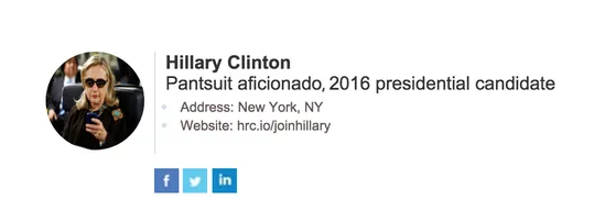
You can break down different sections for a better visual outlook. To do this a simple vertical line can be used as a separator. Why it is effective?
Well, no one wants to see much at the end of an email. Furthermore, if you need to add a bit more, using a separator will make your appearance minimalistic.
The presidential campaign team of Hillary Clinton uses the same technique. They didn’t want to put many things. But they didn’t want to show less either. So they include an image, put a vertical line, and then put the credentials or address.
Bonus Tips
As you are getting through these examples of great email signatures, there are hundreds of different crafts and patterns floating in your inbox. The design we showed here, have their particular reasons. Let’s dig a bit more to improve your email marketing strategy.
Adding CTA is a Plus
It’s not necessary to add a CTA button with your email signature. However, adding one is considered a huge plus. If your other CTA fails, this last one can be a winner. Who knows?

Anyway, this last CTA should be centered more on building a relationship rather than a direct sales pitch. Here’s this Global Inc email that was doing the same thing. They want to sell indeed. But they have a bigger vision which is pretty visible in this email signature CTA.
Don’t Include Email Adress

People don’t need your email address when you are the person sending emails. It’s totally unnecessary.
Reason one, users can easily get your email address because you are the sender. Reason two, if you include one of your different emails, you lose effectiveness. It’s easier to connect with someone who has sole contact information nonetheless.
Closing Up
After you’ve created your email signatures, you need to keep customizing them for better results.
Just like you can use weMail, and improve your email strategy using the advanced features provided by this email automation platform. It’s a continuous process.
So, are you going to try one of the signatures we’ve shown above? Don’t forget to share your opinion in the comments section.


