12+ Opt-In Form Examples That Maximize Engagement
Opt-in forms prompt users to willingly share their information, opening the door to personalized communication and targeted marketing. But, these forms aren’t just about gathering emails; they’re about creating a seamless and captivating user experience.
When users see a well-crafted opt-in form, they perceive it as an invitation into a tailored world of valuable content, discounted prices, and exclusive perks. To truly maximize engagement, you must go beyond conventional approaches and employ creative and strategic opt-in forms.
These forms are your golden ticket to building a community of genuinely interested subscribers who eagerly anticipate your updates. That’s why we’ve gathered some effective opt-in form examples in this post that’ll elevate your engagement. Read on to learn more!
What is an opt-in form?
An opt-in form is a digital or physical form where individuals willingly provide their contact details, like email addresses and phone numbers, to subscribe to specific communications from a business or organization.
For example, suppose you have a WordPress blog with a substantial subscriber base of more than 150,000 members. The blog covers the latest technology trends, guides, reviews, tips, and industry insights. Here’s how you can effectively employ an opt-in form:

The form, seamlessly integrated into the blog’s design, asks for only the required piece of information which is the user’s email address. A supporting copy promises exclusive tech updates, guides, ebooks, and more.
Also read: What Is Double Opt-In in Email Marketing – A Marketers Guide
Importance of opt-in forms in digital marketing
Opt-in forms serve as gateways for businesses to connect with a willing audience. By allowing users to voluntarily share their contact information, opt-in forms facilitate targeted communication, permission-based marketing, and personalized engagement. In this digital world, where user consent and relevance are crucial, the significance of opt-in forms cannot be denied.
- Permission-based marketing: Ensures communication is only sent to individuals who explicitly opt-in.
- Personalization and targeting: Enables businesses to tailor marketing messages based on user preferences, behaviors, and demographics.
- Effective email marketing: Helps in building a strong email subscriber list, allows businesses to nurture leads, and drive conversions.
- Compliance with regulations: Essential for adhering to privacy regulations like GDPR to ensure ethical marketing practices and legal compliance.
- Cost-effective marketing: Marketing to an opt-in audience is more cost-effective, reducing the likelihood of messages being marked as spam.
Basic components of an ideal opt-in form
The following elements comprise the fundamental components of an effective opt-in form. Each plays a crucial role in encouraging user engagement and building a quality subscriber list. Here’s a brief breakdown of each element:
1. Email address field
The email address field is the primary means through which businesses establish a direct line of communication with their audience. By providing a designated space for users to input their email addresses, you can create a targeted and engaged subscriber base.
2. Call-to-action (CTA) button
The CTA button encourages users to take a specific action, such as subscribing to newsletters or receiving updates. By clicking these buttons, users can actively participate and become a part of the brand’s communication channel.
3. Clear and concise copy
Clear and concise copy within an opt-in form is essential for transparent communication. This element gives users an understanding of what they are subscribing to, setting expectations, and building trust. You should use straightforward language to avoid ambiguity. Ensure that users provide their information with a clear idea of the value they will receive in return.
Here are a few generic copy examples that you can get inspiration from:
- Subscribe for exclusive updates.
- Join our newsletter for the latest news and offers.
- Get the latest updates delivered to your inbox.
- Be the first to know. Subscribe today.
- Sign up now and receive a 10% discount on your first purchase!
4. Visually appealing design

Beyond functionality, design elements such as color, layout, and imagery contribute to brand identity and recognition. An aesthetically pleasing form captures attention, communicates professionalism, and reflects the brand’s commitment to positive user interaction.
Explore: 7 Effective Tips to Choose the Best Color
5. User consent and privacy considerations
Opt-in forms should explicitly convey to users how their information will be used. You need to maintain transparency and ethical data practices. Including a checkbox for users to indicate their agreement reinforces the commitment to user privacy and permission-based marketing.
6. Mobile responsiveness
Responsiveness guarantees that users can easily access and interact with the form across various devices, including smartphones and tablets. A mobile-responsive design optimizes the overall user experience and accommodates the diverse ways users engage with digital content.
7. Prominent close option
The “close option” in an opt-in form provides users with a visible and easily accessible way to dismiss the form without subscribing. This element is critical for a positive user experience, respecting user autonomy, and avoiding intrusion. It is typically implemented as a clear “X” or labeled button, prominently displayed, and responsive across various devices.
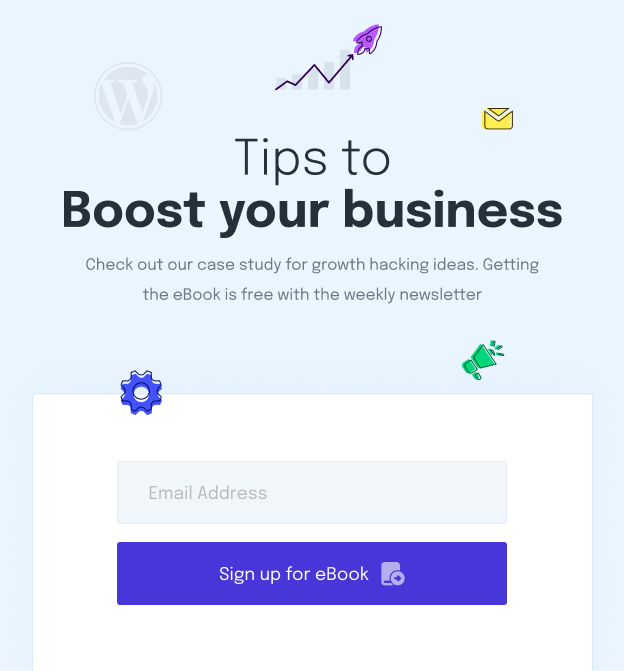
Here’s an example of a pop-up consisting of major elements of an ideal opt-in form:
15 opt-in form examples that can maximize engagement
The effectiveness of an opt-in form depends on various factors, including the website’s design, target audience, and overall user experience. There is no one-size-fits-all answer, and what works best can vary from one context to another. However, some types are generally well-received and have proven to be effective in different situations. Here are a few types that are often considered highly valuable:
1. Email opt-in forms
Email opt-in forms capture user email addresses, forming the foundation of email marketing campaigns. This is the most popular type of opt-in form. Since email marketing has higher conversion rates, every marketer wants to collect valid email addresses that are likely to engage with the business in any way. Using these leads, you can directly provide valuable content, promotions, and updates.
Have a look at the newsletter opt-in form designed by one of the best WordPress blogging websites, WPBeginner.

Get inspirations from: 7 Stunning Newsletter Sign Up Examples that Convert
2. Pop-up forms
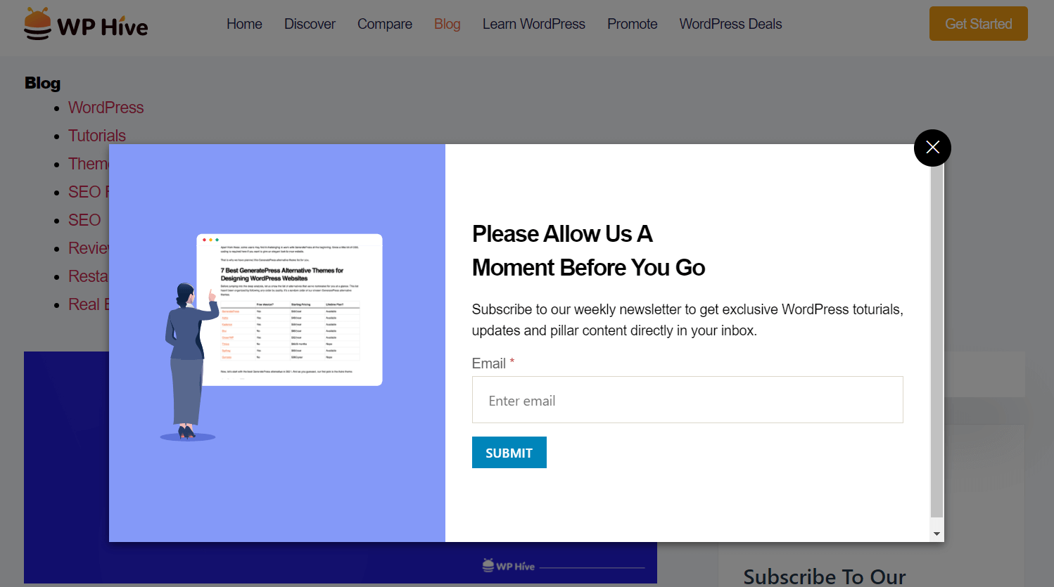
Pop-up forms are attention-grabbing overlays that appear on websites. Strategically timed, they prompt users to subscribe, offering a visually compelling way to capture attention and encourage engagement. The following example is an exit-intent pop-up of WP Hive, it aims at giving a last try to collect the lead.
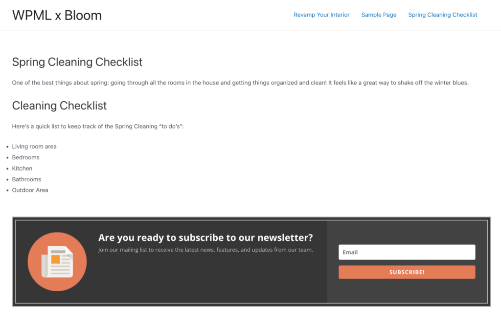
3. Inline forms
Inline forms integrate within content. They allow users to subscribe without disrupting their reading experience. These subtle forms are often embedded within articles or web pages. WPML has prepared a great example of inline opt-in forms.
4. Floating bar forms
Floating bar forms are persistent, narrow bars typically positioned at the top or bottom of a webpage. They remain visible as users scroll. This form type is effective for keeping subscription options easily accessible without disrupting the overall user experience.
5. Slide-up forms
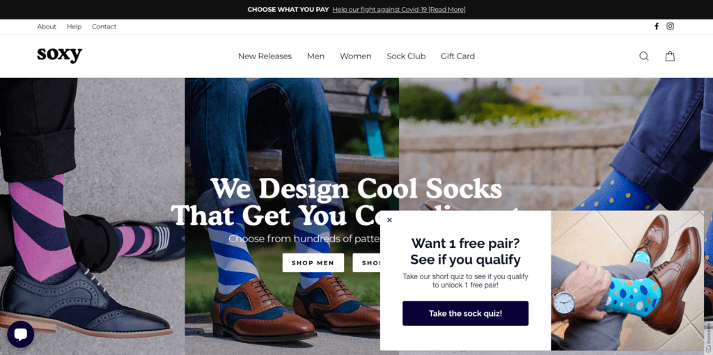
Slide-up forms are discreet and engaging elements that slide into view from the bottom corner of a webpage. Slide-up forms are effective in keeping a balance between visibility and subtlety because they don’t block the entire screen.
6. Modal opt-in forms
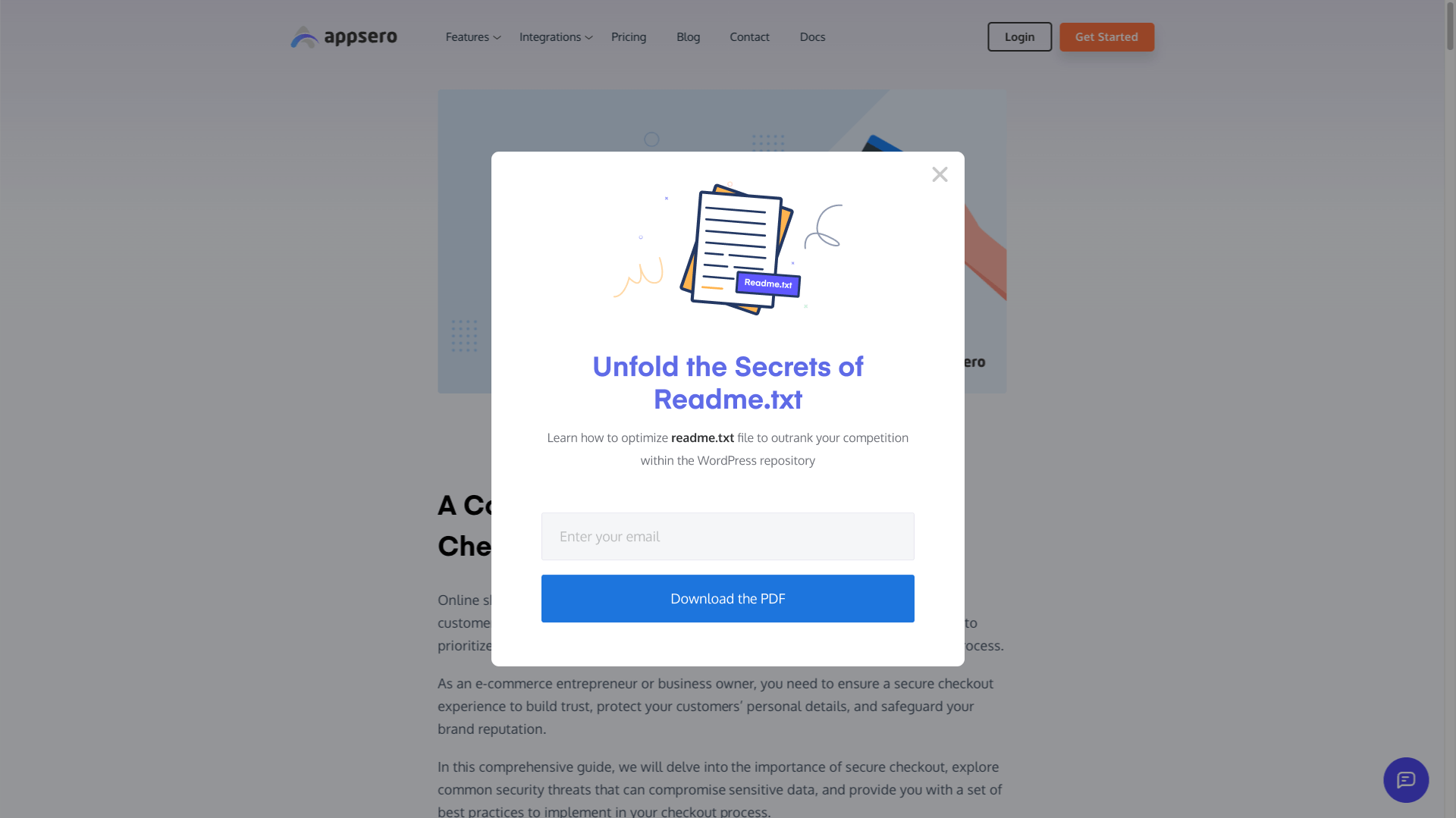
Unlike popups, modals darken the background, focusing attention on the form. They often include an email input field, a clear call-to-action, and additional information. Modal forms are versatile and effective for newsletter sign-ups, promotions, or gathering user feedback.
Their centered positioning ensures they are easily dismissible capture leads and engage website visitors in a focused manner. Appsero shows a modal pop-up when a reader goes past the middle of the single post content.
7. Two-step opt-in forms
Two-step opt-in forms engage users with a smaller action before presenting the full opt-in form. This method often results in higher conversion rates as it involves a micro-commitment before the actual subscription process.
8. Contest or giveaway forms/ gamified forms
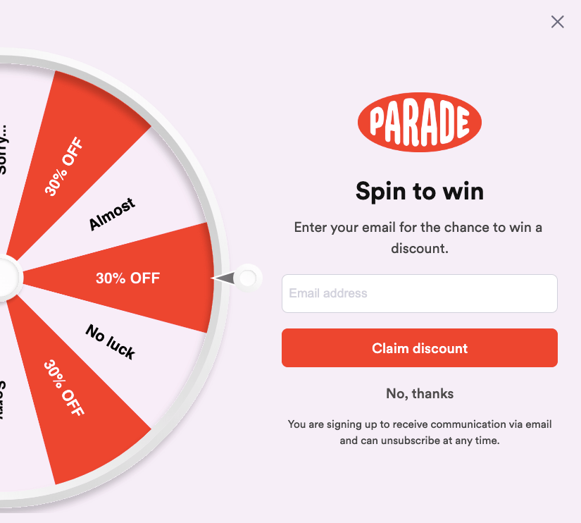
Contest or giveaway forms entice users with the chance to win prizes in exchange for subscribing. This strategy not only boosts engagement but also builds a subscriber list of individuals interested in the brand’s offerings.
9. Fixed opt-in forms
Website body opt-in forms are strategically placed subscription forms within the main content area or any part of the body of a webpage. These forms integrate with the overall design to ensure a natural flow and minimize disruption to the user’s reading or browsing experience.
They typically include an email input field, clear call-to-action, and sometimes additional information or incentives to encourage user sign-ups. Their placement within the body of the page allows for targeted promotion and user interaction without dominating the entire screen. Here’s an example of an opt-in form placed at the footer of Simply Stacie.

10. Checkbox opt-ins
Checkbox opt-ins are included in other forms, like registration or checkout pages. Users can opt in or out of additional communications. They provide flexibility and capture subscribers at different touchpoints.
11. Interactive forms
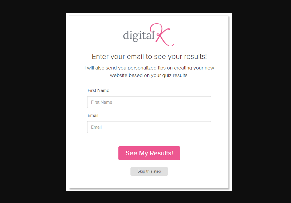
Interactive forms, such as quizzes or surveys, engage users dynamically. By combining entertainment with subscription prompts, businesses create an enjoyable experience, encouraging users to subscribe for personalized content. Suppose you let your readers participate in a fun survey or quiz and allow them to see the results at the final step by providing their email addresses as shown below.
12. Scroll-triggered forms
Scroll-triggered forms appear as users scroll down a page. This method captures attention as visitors engage with content, presenting the opt-in form at strategic points in the user journey.
13. Full-screen overlay forms

Full-screen overlay forms cover the entire screen, directing users’ focus to a specific call to action. They provide a concentrated message and are often employed for impactful subscription prompts.
14. SMS opt-in forms
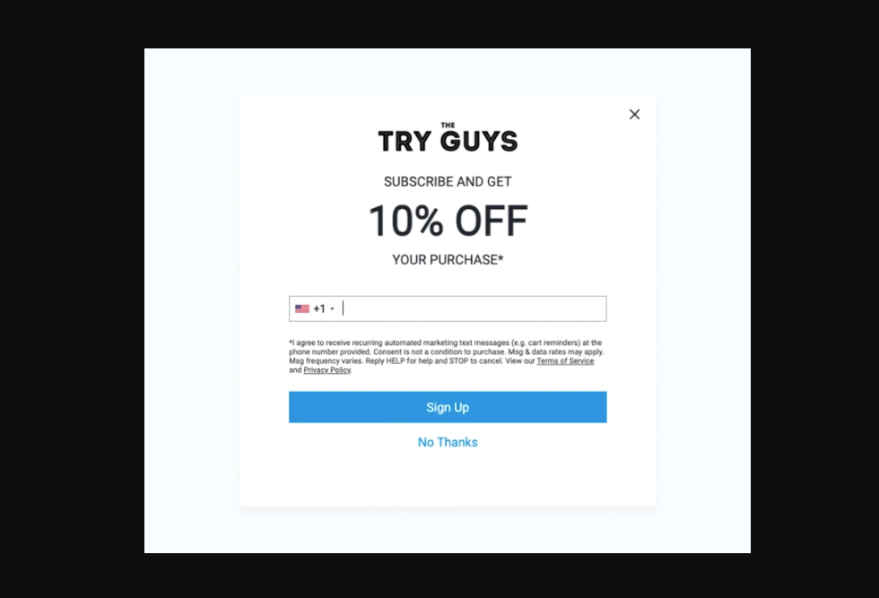
SMS opt-in forms collect phone numbers for text message marketing. Users opt-in to receive promotional texts, providing an alternative communication channel beyond email. Let’s have a look at this SMS opt-in form example by THE TRY GUYS.
15. Timed delay forms
Timed delay forms appear after a preset time, preventing immediate disruption to the user experience. This approach allows businesses to choose the optimal moment to present the subscription offer.
Use weMail for ready-made opt-in form templates
weMail comes with a form-building feature that allows users to create four types of opt-in forms including Inline, Floating Bar, Slide Up, and Modal.
You can create amazing-looking forms by navigating to weMail > Forms > New Form from the WordPress admin panel. Give a suitable name and choose your preferred list from the dropdown menu.
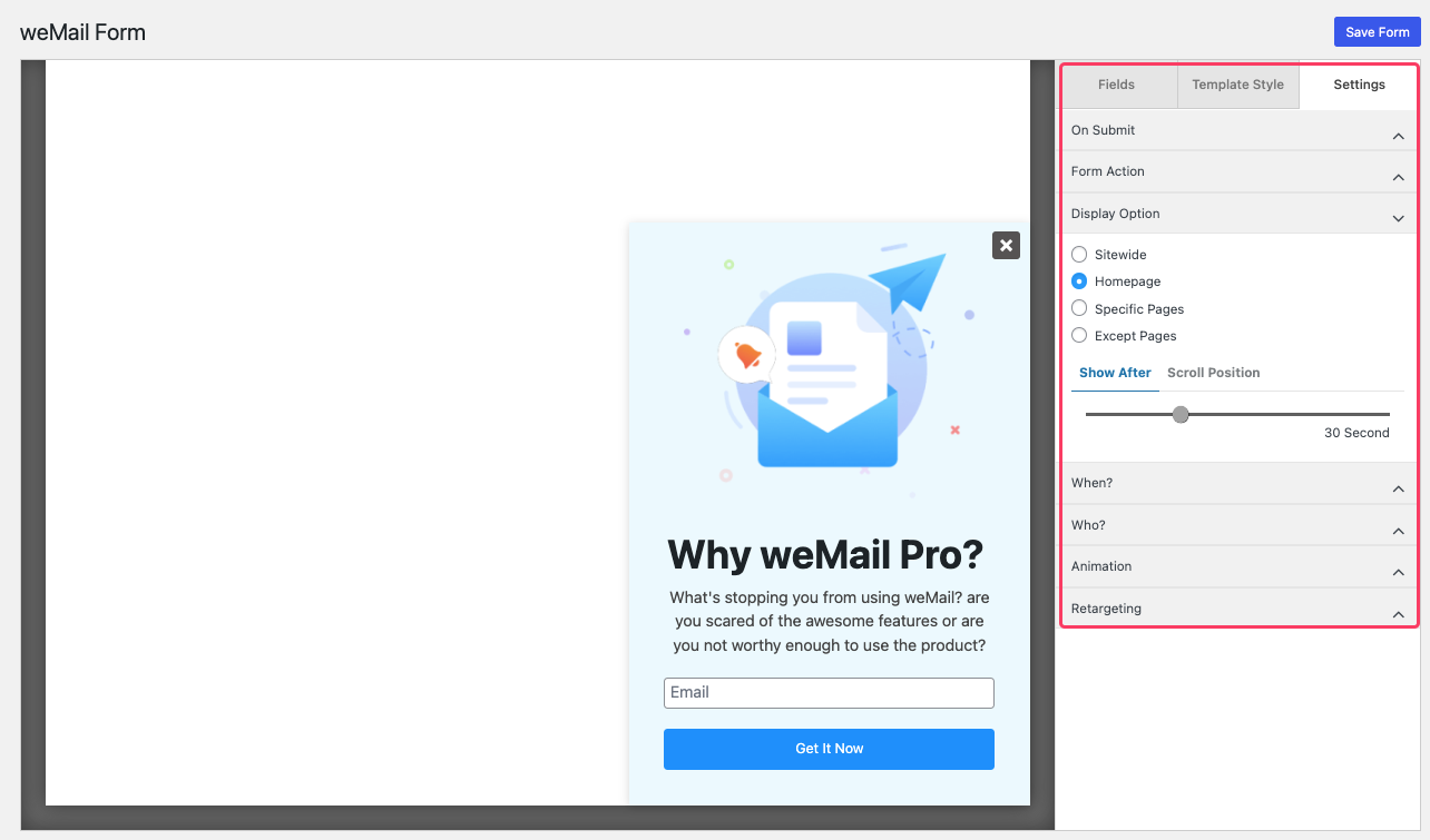
You can customize each field, stylize the templates, and define the display options as per your campaign’s needs. Follow our doc on How to Create Your First Form to get a detailed user guide.
Final thought
As we wrap up our exploration of impactful opt-in form examples, it’s clear that these aren’t just checkboxes on a website; they are dynamic tools shaping user experiences. Each subscription is an opportunity to build a community of enthusiasts eagerly awaiting your updates.
So, embrace the best practices, infuse creativity into your forms, and watch as your audience engagement grows. Now, go ahead and transform your email marketing efforts with forms that speak volumes and resonate with your audience!


