How Landing Pages for Email Campaigns Increase Your Email Conversion Rate
Do yourself a favor. Can you imagine the scenario given below?
You sent highly engaging emails to your fresh leads. With exciting offers, quality content links, and some words which are more than trustworthy. People rushed towards your website by clicking the CTA. Then boom! The conversion rate stays the same or lower. Even a few weeks later, you notice that you are losing your subscribers one by one!
It’s terrifying, right? But as a smart marketer or business owner, you never going to let that happen I presume. On the contrary, you should check your landing pages. Maybe they are not converting enough. Maybe they are failing to guide your visitors or even make them stranded whenever they land in your pages.
Yes. Only great products and quality content aren’t enough. You need to create such highly engaging landing pages for email campaigns that help your visitors all the way.
In this blog, we will show you how to turn your landing pages a booster, and eventually increase your email conversion rates. Keep reading.
Why Your Landing Pages for Email Campaigns Should Make a Difference?
In today’s highly saturated digital marketing atmosphere, you don’t want to let any stone untouched to become a success. Hence, the landing pages of a website remains always a keystone that can create magic.
If the visitor can’t find something easily, it does not exist.
Tim Ash, Landing Page Optimization
Whenever a subscriber or visitor comes to your website through your email CTA, a communicative landing page can help her/him to perform such actions you desire. That means strategical landing pages for email campaigns influence the visitors and send them in the right direction.
If you need more signups, a signup landing page with the minimum requirements will be more converting. If you want your email recipients to make a purchase, you must design your conversion page with exact details and guidelines.
Almost 68% of B2B companies are using landing pages for email campaigns to generate leads. 44% landing page CTA directed towards the homepage of a website.
Therefore, you can use your landing pages from the very start point of the visitor’s journey. Then take them to the final conversions and strategic retentions. Let’s see some of the crucial jobs your landing page should do to gear up your business and more.
6 Best Landing Page Tips to Increase Your Email Conversion Rate

Sending emails just marks the beginning of a relationship with your subscribers. But any email campaign needs to have specific goals. Hence, if your goal is to increase conversion rate through your emails, it requires redesigning the web pages you want your visitors to land.
1. Understand What You Want to Achieve from Your Email Campaigns
Well, we have already said this. It may sound very primary and obvious, but setting a goal, and understand it remains quite challenging. Before proceeding further, you must understand what to achieve through your landing pages for email campaigns.
Let’s consider some of the popular types of email campaign goals –
- You can collect sign-ups
- You can collect donations (we will show you a proper example in the next point)
- Increase your sells
- Offer a tutorial or eBook download
- Ask for reviews, etc.
Inevitably, these all activities can lead to increase your email conversion rates. But what if you don’t know which accomplishment should be your priority for a singular email campaign? If that’s the case, all your efforts may end up to disappointment.
Now, take a look here at this Spectator’s “Subscribe for just £1 a week and get a Spectator cool bag, absolutely free” campaign. I’ve got this a few days ago.
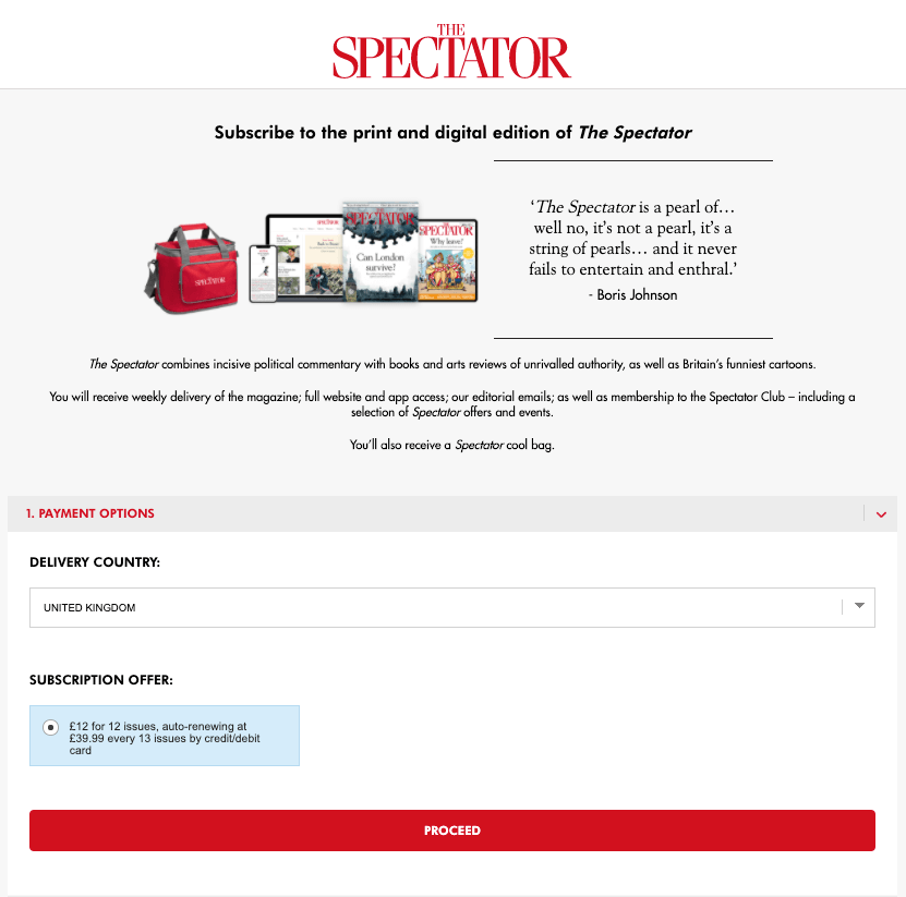
When you click on the subscribe now button, it just takes you to the above page. Where you can easily understand the gifts and their message copy. And then a responsive way to complete the subscription process.
So, before you apply any of landing page hacks to increase email conversion, you must know what types of landing pages for email campaigns you should create.
2. Make Your Landing Pages Simple and Clear
Suppose, you want to start a flash sale. In such case, your email CTA should direct a reader to a sales page. You must design this page with simplicity.
The goal here is to show visitors how to start shopping at the lowest price you are offering. So just give them the option to start shopping and include your offer list. That would suffice.
For example, look at the donation page of Khan Academy below.
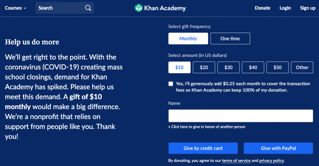
Whenever they send an email to inspire their patrons to donate, the subscriber can directly reach this page.
Khan Academy simply uses the message section on the left to show their empathy and motivations following different situations. And provide straightforward options and payment methods to collect donations.
However, the best way to create clear and easy landing pages for email campaigns is to ask some question and answer them one by one –
- Tell your visitors where they are
- Tell them what you do
- What’s your offer
- Give them reasons why should they choose you
Hence, a highly converting landing page blend two things to make a perfect first impression. It conveys the message, and show a visitor what to do in the simplest and easiest manner.
3. Avoid too Many Call to Actions
CTA buttons are essential. They can make a visitor take action, and provoke them to do the exact thing you want from them. So, any landing pages for email campaigns should include a call to action button.
But remember that, if your email campaign has a singular goal, you must not let your visitors defocused. To stick with achieving the success of your campaign, one CTA is enough.
More than 90% of visitors who read your headline also read your CTA copy.
Unbounce
If you add more than one CTA, it would divide the attention of your subscribers. They may hesitate before taking action. Which is literally contradictory to the goal of a CTA button.
According to Marketing Experiments, a user click on a CTA if it manifests the below quality –
- Capable to gain attention
- Connect users
- Show a problem
- Make the users interested in doing something
- Create suspense
- Transfer momentum
Therefore, when you put a single landing page CTA, surely it will increase your email conversion rate.
4. Write Landing Page Copy that Converts
Here comes the tricky part where words are everything. Either your landing page copy does the job or remains totally inactive. Even if you add a YouTube video, you must put a description or title that can make a visitor click the play button.
Many websites failed to do so. Almost 75% of companies see it as a big problem to find the proper and effective copy of their landing pages for email campaigns.
However, if you care enough, writing a highly converting landing page copy is totally possible. The truth is that only a few businesses understand the very importance of it. So if you are careful enough, your chances of success are on the rise.
In one of their specialized findings, OptinMonster gathers some of their top copywriting experts, and they shared some actionable tips to write landing page copy that converts. Take a look at them below –
- While writing the landing page copy, ask yourself what do you want to get from it. What is your desired outcome?
- Answer some more questions like – Who you are? What is your offer? Why does someone want to go for your bargain? Give them reasons.
- Do thorough research on your service, proposition, and value.
- Don’t forget to test the effectiveness of your CTA buttons.
Now, look closely to this landing page examples of Evernote.
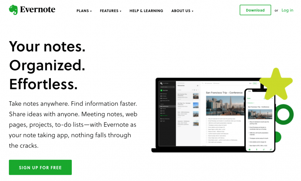
In the header, Evernote tells their visitors what it really can do for them. At first, it personalizes you, your needs, and show the benefits. Then, they tell you to sign up for free.
So, the game is you need to find the most relatable words, then put them through your landing page strategically. That’s how your landing page for email marketing can be rewarding.
5. Let the Visitors Stay with Your Website
Well, this is one of your goals, right? We never want our customers to come into our shop and left without converting. We must follow some unique ways to avoid this possibility.
When someone opens your email and come to the landing page connected with it, that means your email has done its job. The next phase is conversion, and your landing page is responsible to turn the table.
Typical landing pages, to be more specific, most of the email landing pages follow the cliched tropes. They have headlines, they have footers, a form with lot of thing to be filled up, single or multiple dull types of CTA. Or even, they may be smart in some sense. The copy is good, and the outlook of the email landing page is minimalistic. But it offers nothing more.
But as a creative marketer, you can apply new tropes. Just like Grammarly is doing.
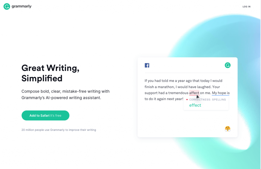
The above landing page not only give you a clear idea of the platform, it also show you how the tool works to check your grammar. It shows no distraction, and a little bit of amusement.
Modern web visitors are smart. So should your email marketing landing pages are. Don’t leave any escape route for your probable users. Be imaginative and inspired by industry experts.
6. Create Landing Pages Similar to Your Email Design
A few days ago, I’ve got a promotional email from Udemy. One of the instructors shows me the details of the offer. And add visual links to several courses.
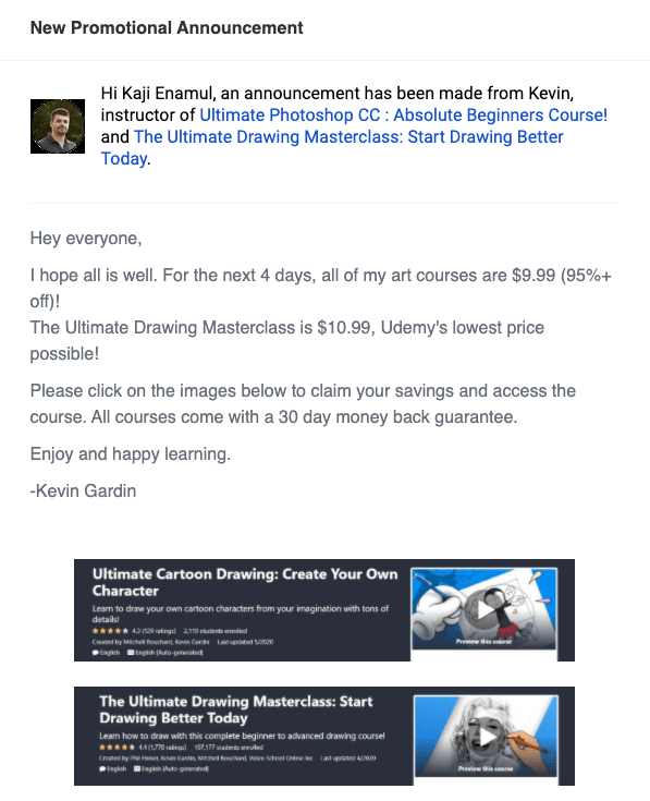
I’ve clicked to the Cartoon Drawing course, and wind up to the course page directly. And I found what I was expecting. The email and landing page were similar, and indeed it created a positivity.
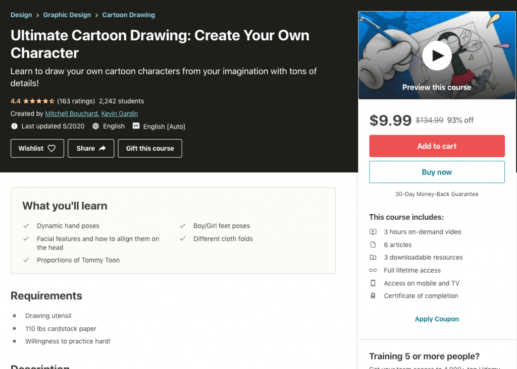
This is an underrated but highly effective tip. People who open and read your emails, they also want to check if you are really providing something they can trust.
Suppose, you have subscribed to a sports brand. They sent you an email designed for summer sale with sunny template. You click on the CTA and it take you to a landing page that reflects a darker theme like cloudy sky or the background color is black. Will you like it?
Most of the top brands either design their email following their website theme, or they create landing pages for email campaigns based on their email templates.
Final Thoughts
If your emails are the key to the conversion process, your landing pages for email campaigns work as the door. So, the best way to get the highest results, you must combine these two things with a strategic plan.
Experts or industry leaders are inventing different hacks continuously. They are endless. But success is limited to those who love invention and cope up with the changes.
A/B testing is one such strategy to get ready to apply any newest element to increase your landing page email conversion rate. Test everything like appearance, copy, headlines, forms, and responsiveness. You should do it because only the testing let you understand which part of your landing page isn’t working.
So, tell us now. Which landing page tips you believe to help increase your email conversion rate more?


