Newsletter Landing Page – The Ultimate Guide You Should Follow
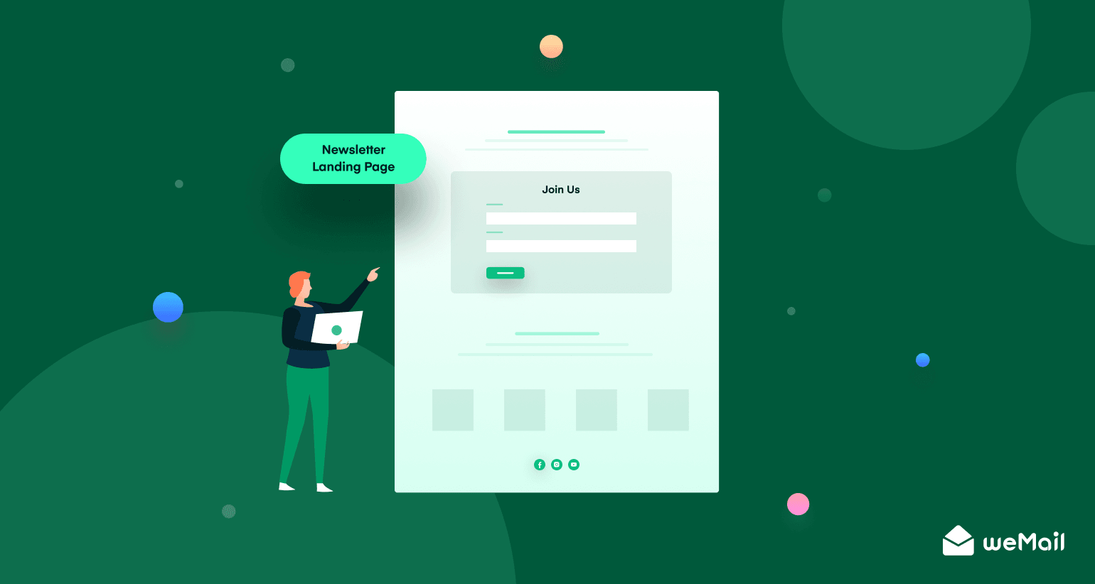
Do you want to generate more leads and stay connected with your target audience?
Sending newsletters from time to time is one of the smartest ways to do so. But how could you let people subscribe to your newsletter in the first place?
The newsletter landing page comes into play in this case. You can attract the audience and encourage them to subscribe to your newsletters by building nice and appealing landing pages, particularly for this purpose.
To help you out, we are going to discuss all the necessary things about newsletter landing pages here in this article – from the definition to the best practices.
We have prepared this article based on our experience since weMail is an effective email marketing and subscription management tool. Let’s get started.
Table of Contents
- What is Newsletter Landing Page
- Why Would You Need a Separate Newsletter Landing Page
- Newsletter Landing Page Best Practices You Should Follow
- Best Newsletter Landing Page Examples to Take Inspiration
- FAQ on Newsletter Landing Page
- Start Building Your Newsletter Landing Page Now
What is Newsletter Landing Page
A landing page is a location on your website where the users land after clicking through from an online search, email, ad, or other digital location. Its goal is to persuade your audience to complete a specific action, like making a purchase or becoming a subscriber.
A newsletter landing page is the kind of landing page where you persuade the audience to subscribe to your weekly or monthly newsletters.
If you can build and use it properly, a newsletter subscription landing page can be a big source of revenue and lead generation. Besides, some businesses are entirely dependent on subscriptions. So, it’s a big opportunity for you if you are one of them.
Example: The design and structure of a newsletter landing page vary based on website type and personal taste. A typical landing page would look like the following image (Column Five Media) –
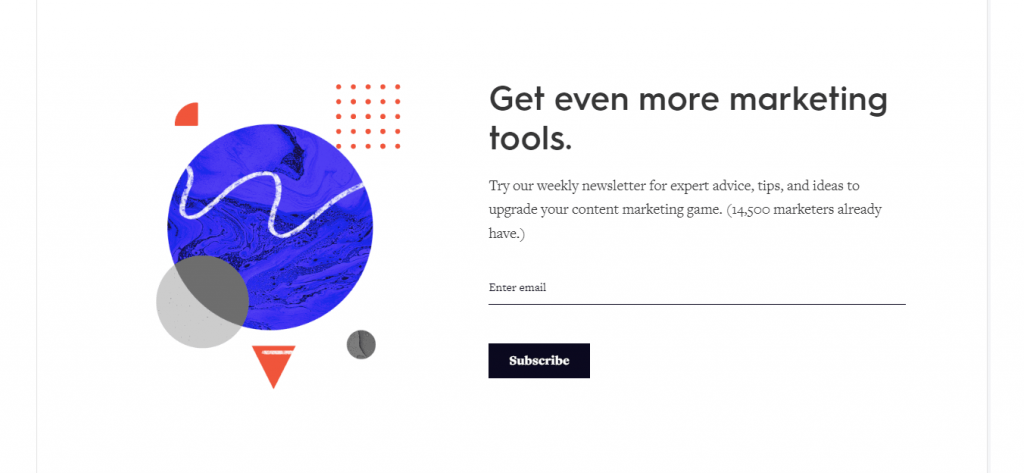
We will show you more newsletter landing page examples and talk about them in the latter part of this article. Let’s discuss some other basics before that.
Key Elements of a Newsletter Landing Page
A newsletter landing page contains many materials from a typical landing page but in a different fashion. So, the key elements of a newsletter landing page are:
- Headline: Draws users’ attention and gives the first impression.
- Description Copy/Body: Tells why the audience would sign up.
- Visuals: Make the page attractive and help users to memorize it.
- Call-to-Action Button: Encourages users to click and do the subscription.
We will talk about the key elements in detail and share some tips on how you could make your landing pages more attractive and efficient in the newsletter landing page best practices section. Stay with us until then.
Why Would You Need a Separate Newsletter Landing Page
There are many ways to persuade your website visitors to subscribe to your newsletters. You can add the subscription form to any of your pages, underneath a blog post, or use popups, and so on. Then, why do you need a separate landing page for newsletters?
Making a separate newsletter landing page gives extra emphasis on the subscription process that helps draw users’ attention more and convinces them to sign up.
Besides, if you want to add a button or share a link asking users to subscribe to a blog or social media post, you will need to build a separate landing page.
After bringing the users to the landing page, you can persuade them to become newsletter subscribers by letting them know how they are going to benefit. Here, you will also get the opportunity to attract users with nice visuals and useful information.
Newsletter Landing Page Best Practices You Should Follow
You need to follow the current best practices and trends if you want to build an attractive and effective landing page for newsletter subscriptions. We have covered this segment with some of the top tips, relevant examples, and useful information.
The best practices of newsletter landing page you should follow are –
- Specify Your Goals and Possible Outcome
- Use a Short Yet Attractive Headline
- Write a Compelling and Skimmable Copy
- Use Attractive and High-Quality Images
- Keep Subscription Form Above the Fold with Fewer Fields
- Add a Vivid and Engaging CTA Button
- Thank the Users After Subscription Completion
- Add a Short Video (Introductory or Company Profile)
- Introduce First, Promote Letter
- Analyze Performance and Change Design If Necessary
Now, we are going to talk about each of the points in detail.
1. Specify Your Goals and Possible Outcome
It’s very simple and common practice. Before taking any initiative in your business, you need to finalize what you want to get and how much it is possible to get. Since creating a landing page is a part of your marketing strategy, you need to be very specific.

The four major things you need to specify are:
- Page Visit – how many visitors do you want to get on the newsletter landing page each day.
- Subscription Rate – what percentage of those visitors do you want to turn into subscribers.
- Investment – how much money and resources you can invest to achieve these goals.
- Feasible Outcome – what is the tentative outcome and how much it’s possible to reach the target.
Now, you can proceed to the next stage and formulate your strategy to achieve the goals. Yes, you can do experiments. But even an experiment needs to have a certain plan and specific goal. Besides, there is a low chance of becoming frustrated if you fix your goals and know the possible outcome.
2. Use a Short Yet Attractive Headline
The heading of your newsletter landing page is the first (sometimes the only) text the audience will read. So, you should be very careful about it and give your best possible effort to grab the users’ attention.
Write a short but powerful headline. Be creative and avoid cliches. Try to introduce your brand, while telling them how they will be benefited with this subscription briefly.
We will recommend you use one headline, then a sub-heading if necessary, and finish the entire heading part within 2 to 3 sentences. You will get the chance to describe everything – talk about your company and persuade the audience – later on when you will write the copy.
3. Write a Compelling and Skimmable Copy

After grabbing the users’ attention with an attractive headline, it is time to convince them to sign up for your newsletters. So, your description copy has to be compelling and easy to skim through. Follow these practices to know how to write a good copy:
- Keep it short and precise
- Tell them how you or your company can be helpful
- Focus on the benefits of this subscription
- Use lists/bullet points, numbers, and statistics
- Write in simple language with short sentences and paragraphs
You need to give all the basic information about your company and the subscription and encourage the users to sign up at the same time in this part. But you will have to make it short. So, you should use fewer words but organize them intelligently so that users can scan them easily.
4. Use Attractive and High-Quality Images
Images are the most important element of any kind of document that rarely escapes users’ attention. One simple image can change the look and feel of an entire page sometimes. That’s why you need to be very careful here.
Use high-quality, clear, and appealing photos and illustrations. Try to keep them in large size.
You can use images as the background of your page. You can also use them as in-page design elements. Wherever you use them, just do it wisely.
5. Keep Subscription Form Above the Fold with Fewer Fields
People usually do not want to spend much time going through your entire landing page, finding out the subscription form, and filling it up. So, you should design your page in a way so that they can easily see the form and fill it up quickly.
The best practice is to keep the subscription form above the fold of your page and use fewer fields (2 to 3 maximum).
You will have a better idea if you see the image (TDP Clothing) below:
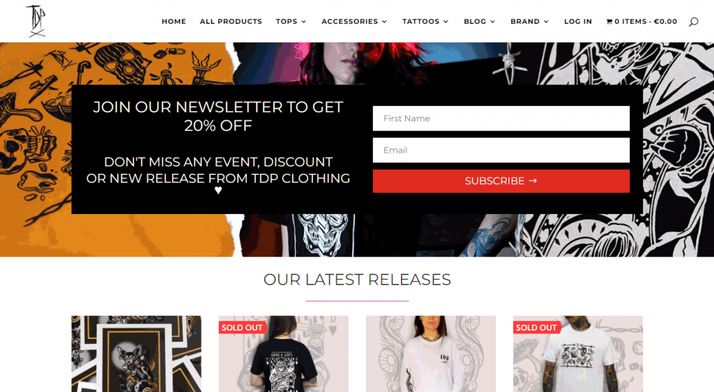
This page contains many elements, but the site authority still manages to keep the subscription form on the upper portion of the page. The form is placed nicely, looks very attractive, and has only 2 fields.
6. Add a Vivid and Engaging CTA Button
A call-to-action (CTA) button aims to encourage users to take a certain action. On a newsletter landing page, users generally finish the subscription process. You can follow the tips below to make your CTA button unique and more attractive.
- Use eye-catchy color
- Keep it large and simple
- Try to use unique text instead of just “subscribe”
You need to put the CTA button underneath the subscription form. You won’t have to worry about it though as most of the form plugins handle this segment.
7. Thank the Users After Subscription Completion
Many websites do not let the users know whether the subscription has been completed or not after they hit the CTA button. It’s a very very bad practice, and you must about such irresponsibility.
You shall not only confirm the users about the completion of the subscription process but also thank them for their time and interest.
It’s not difficult to thank the users. You can do it easily by just creating a popup. Read this article to learn How to Create a Popup on WordPress.
8. Add a Short Video (Introductory or Company Profile)
Video is a big thing in the digital world at present, particularly in marketing. And it’s true for building a landing page as well. Because embedded video content can increase conversion rates by nearly 86%.
You can add short relevant videos about your company, product, or the subscription itself on the newsletter landing page instead of using too much text. It will enhance the user experience significantly and encourage your audience to sign up.
9. Introduce First, Promote Letter

The newsletter landing page aims to collect leads or turn visitors into subscribers. Once you have done that you will get plenty of opportunities to promote your company and products. First, you will have to nudge them, then go for promotion.
Therefore, on the landing page, you should mostly focus on motivating them to sign up while introducing yourself. It’s better not to start the promotion first. You have to keep the page straightforward and avoid distractions.
10. Analyze Performance and Change Design If Necessary
It’s not a good idea to stick to a landing page for good. Who knows! Visitors might not like your page. So, you have to stay updated about your page performance and change the design sometimes. Just follow these tips:
- Analyze page visit and subscription rates
- Update the page and its information regularly
- Change the page design if performance falls
- Build separate pages for different products
This marks the end of our top tips on newsletter landing pages and the best practices you should follow. You will be able to relate your learning if you see the best page examples now.
Relevant Articles: 11 Simple Newsletter Ideas That Can Impress Your Reader Most + Email Newsletter: 6 Mistakes to Avoid
Best Newsletter Landing Page Examples to Take Inspiration
Newsletter landing page design is not all about incorporating graphically-rich elements. A good page needs to be simple, attractive, meaningful, and contain fewer steps to finish the subscription process.
You will have a better idea after seeing the examples below. We have included some of the best examples of newsletter landing pages in this part from which you can take inspiration while building your own.
1. CoffeeCup
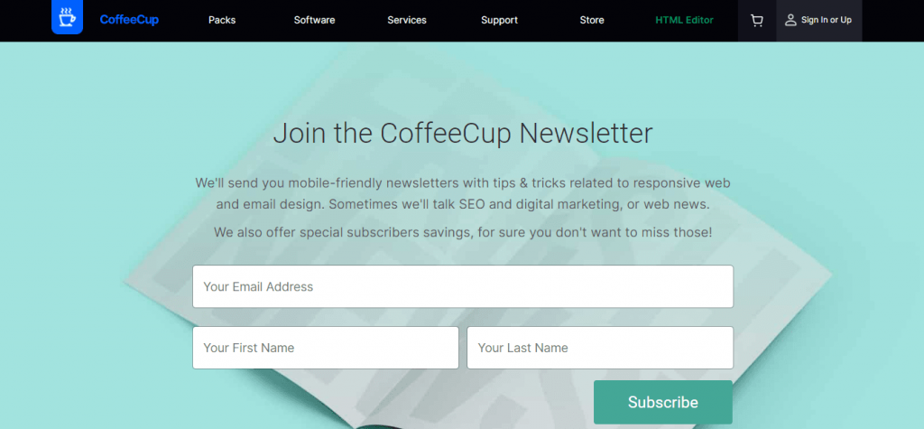
The newsletter landing page of CoffeeCup is bright, clean, and easy to read. It also tells users exactly what to expect when they subscribe. Plus, this page is easy to navigate and doesn’t ask for a lot of personal information.
2. Back to Health of Anthem
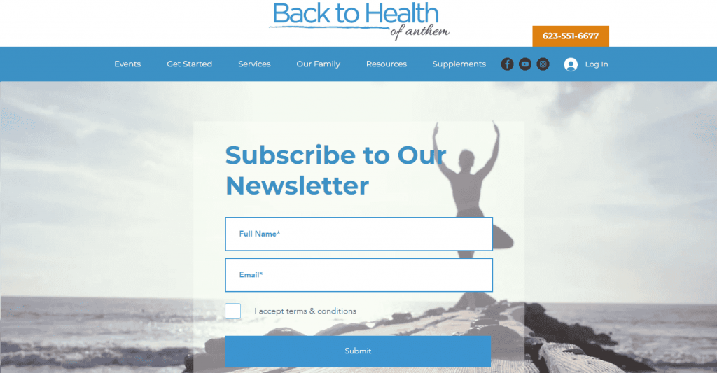
This landing page, from Back to Health of Anthem, is simple but attractive. It uses a beautiful background image which makes the page meaningful and gives you an insight into what this company does.
3. Toasting Good
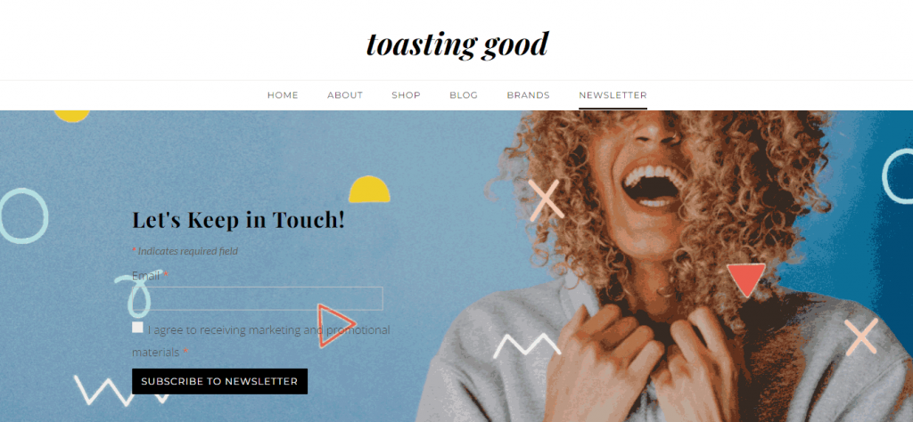
Another example of simplicity and beauty. This page from Toasting Good is my personal favorite. It is simple but compelling. It also has a separate menu for the newsletters. Its background image is fantastic too.
4. Julian Fashion
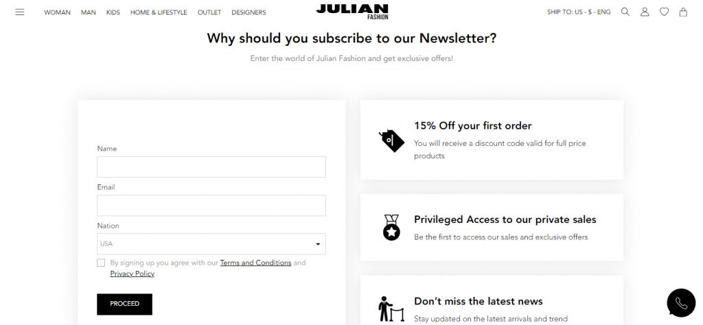
The company Julian Fashion integrated some offers to its newsletter landing page which makes this page special. Telling the users preciously what they are going to get out of the newsletter subscription or giving them any offer is a good page design concept.
5. Kitchen Garden Foundation
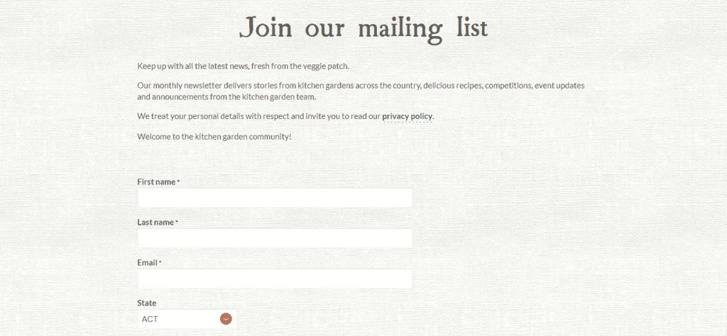
The beautifully textured design of Kitchen Garden Foundation’s page immediately grabs user’s attention. This page is aesthetically pleasing and clean. It also has a menu for the newsletters on its homepage and uses a nice background image on the upper fold (which we couldn’t cover in this screenshot).
6. Close
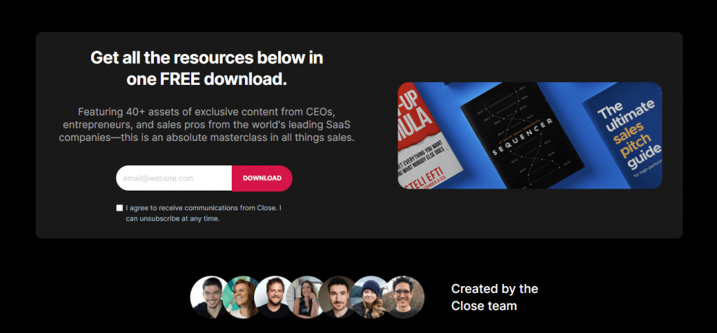
This is not a typical newsletter landing page yet it’s simple and attractive. Close lets users download its resources by just submitting an email address. This process automatically subscribes the users to the newsletters. Several top IT companies, including HubSpot and Mirakl, follow this approach.
7. Engaio Digital
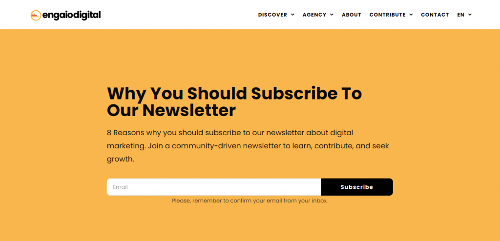
The page design of Engaio Digital follows an entirely different approach. You can subscribe to their newsletter immediately by just entering your email address. You can also scroll down for insights into why you should subscribe. It has written an entire article on it!
Also Read: 7 Stunning Newsletter Sign Up Examples that Converts and 7+ Best Free Newsletter Templates To Use
FAQ on Newsletter Landing Page
We have included some frequently asked questions on newsletter landing pages here, some of which you may find useful.
What should be on a landing page?
A landing page must contain the following:
1. Headline and sub-headline (optional)
2. Body – brief description of the product or purpose
3. Visuals – at least one supporting image or short video
4. Call-to-action (CTA) button to accomplish your goal
Optional: Certifications, User Testimonials, Proof Elements, Social Links.
Where should a newsletter go on a website?
You can use newsletter subscription options on your website as a popup, link, header, footer, sidebar, or standalone page.
Is a landing page a homepage?
A homepage can be a landing page sometimes. A landing page is a place where visitors land and accomplish a specific task. If you design your task centering on your homepage, then it can be your landing page as well.
Start Building Your Newsletter Landing Page Now
We hope this article helped you learn all the necessary things about a newsletter landing page. Now, it’s time you start building your page.
We have published many articles about newsletters on this site so far. We will highly recommend you check some of those before you start your journey. To help you out, we have already linked the relevant articles in the previous parts. So, don’t forget to check them out.
After building your desired landing page, you will begin to collect the leads. At that time, you will need an email marketing and subscription management solution to maintain the entire process. weMail can be a big help for you in this case.
