Make Accessible Emails To Your Audience In 7 Easy Steps (Tips & Tricks)
As an email marketer, you must confirm your emails are sent flawlessly and accessible to all devices of your subscribers. This is how you can figure out your email performance and analyze it for further initiatives
But unfortunately, it’s true that sometimes your emails may not able to reach everyone in your subscriber list. Or your emails may be missed by a particular group of your subscribers. For example, people with visual, physical, or cognitive and neurological disabilities.
More than 15% of the world’s population lives with a disability
World Bank
However, to solve this issue and make your email stand out among all your targeted audiences, accessible emails can change the game for you.
Okay before we share seven effective tips to make your email more accessible, let’s shortly explore what is accessible email and how it can help you to create a better impact on your users by boosting up your email marketing strategies with ease.

What is Accessible Email & How Does it Work
Generally, accessibility in email marketing means, creating or keeping the email content that is accessible, usable, and also readable for all people including readers with disabilities.
Now, check out the points below on how accessible emails can facilitate your email campaign and boost your email open rate reaching all the subscribers on your list.
- Improves your email typography
- Increases readability
- Helps to keep relevant components in the email body
- Assists you to utilize the right use of colors in email
- And lastly, keeps your email easy, understandable and interacting
So now, by the above points, you may understand how does actually accessible emails work and furnish your emails. Right?
Or if you still have confusion or misconception regarding accessible emails or anything related to it, no worries! all your confusion will disappear after a while.
Because we are going to share some useful strategies in the next section. Surely, you can easily make your email more accessible, effective, and engaging.
Related article: How to Write an Email For Newsletter
Strategies You Should Follow to Make Your Email More Accessible

According to the WHO (World Health Organization), more than 285 million people worldwide are considered to have visual disabilities with other differences and 36 million are blind, 246 million have the eye-sight issue.
As an email marketer, surely you want your email marketing tactics to perform the best and reach your targeted audiences. So, you must better have plans for people in all situations and circumstances.
Yes, here you’ll find the best practices for writing an accessible email for your email campaign. Thus it will flourish your email marketing plans and help you to reach all your subscribers including people with disabilities.
Use The Email Colors Wisely
Well, we’ll not talk about the importance of colors in branding here. Rather we’ll talk about why you should choose the right email colors to keep your email accessible and understandable.
Colors with good contrast can play a huge role to reach out to all the subscribers. And the reason is, color can catch the reader’s attention, increase visibility, and give a positive vibe, especially those who have color-blindness.
Subscribers with color blindness may unable to distinguish between some colors in your email
So how can you find out the right group of colors and determine which colors group is working or not? Well, you can always A/B test your email before you send your subscribers.
However, you can take an example of Shopify, they used green instead of red color on their CTA button. And surprisingly, they increased their email open rates by 21% more clicks.
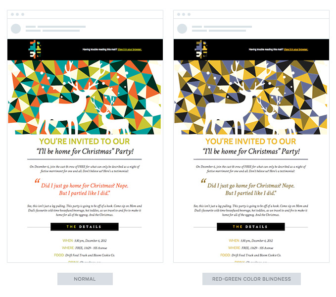
Therefore, it’s required to apply a high color contrast between different components in your email, especially between copy and background colors. In that case, you can check your email color contrast to confirm whether your color contrast ratio is fine or not.
Provide Relevant Contents in The Email
Businesses could smoothly improve their email efforts & activities just by sending more informative content
Campaign Monitor
Well, if you’re writing a blog post, you can easily express elaborately in your blog post to make your readers concerning what you’re trying to tell or not. But when it’s in email, you have to be careful keeping a standard format of your email text.

That means you should use more specific and precise content so that your email receiver could easily grasp and open up your email. However, it’s a general format that you should use for your all subscribers.
But what should you follow for that particular group of people which we are talking about? Yes, of course, there is a solution.
To provide precise and relevant content, you need to keep an eye for those people with disabilities also. Maybe they are not used to receive animated things, GIF files, photos, or emojis in their emails.

So try to avoid flashing contents while sending emails to these individual groups. Before you send emails to these special people, you can segment them and create a special email list for those people with issues. And finally, provide them what they can hear and understand easily. For example, you can create and send special podcasts.
Optimize Your Email Typography Tactics
Typography is also a major fact in order to maintain accessibility in emails. Actually, what does it mean (email typography)? It means the use of different fonts, sizes, and styles in an appropriate way while sending emails.
So now, how can you apply email typography to make sure accessibility in your email? Actually, readers with no sighted issue can easily go through your email without any hassle. But blind users could find difficulties to read your emails, in that case.
Use Serif or Sans Serif fonts that execute well on every email client and device also that is easily accessible for all
Business to Community
Therefore, you can always check your email design screen readability to confirm whether your email structure is okay or not. Here is how you can scan your email content design with the popular screen scanner.
Therefore, people with different issues can easily:
- Read or spell a word
- Go through a line or full screen of text
- Identify the location of the computer’s cursor or focused item
- Read highlighted text
- Recognize the active choice in a menu
- Find text displayed in a specified color
Use the Right Images that Really Matters
Using the right amount of images really makes a crucial impact on users along with typography. According to the research, more than 65% of Americans are visual learners.
So, by picking up the appropriate image for your email, you can help your subscribers to know more about your product, service, or brand for even users with disabilities also.
Here you can take the example of ‘RIP CURL’. They used the image by giving its importance to the users. It can easily make you feel that you need a ‘Hoodie’ for yourself. Which we can recommend below one as a personalized email also.

So this is how you can utilize the proper use of an image in your email. Thus it could firmly make your subscribers so especial.
Also Read: Top 10 Common reasons why email goes to spam
Focus on Readability in Copies
In case you are writing an email, you can’t be a robot or look like a bot while your readers are reading your copies. So it’s mandatory to keep your writing copies easy, readable, and accessible.
However, you can always check the readability of your email copies whether it’s optimized or not. In that case, you use Microsoft office content readability checker to make sure your content is 100% readable.
So using the checker you could able to figure out some crucial information of your copies. Here are they:
- If your score is 90-100, then an 11-year-old student will easily understand your copies
- If the score is 60-70, 13- to 15-year-old students can easily find your content readable
- If the score is 30-50, then college students can understand your writings
- And lastly, if your score is 0-30, university graduates can find your content readable
So this is how you can optimize your content to make it more accessible, readable, and genuine.
Use the Alt-Tag Carefully
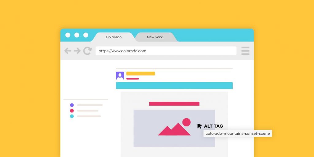
Well, we sometimes don’t allow the images to load or switch off the image loading process. And this is where an Alt+tag can come to play the role. In fact, it can show the details of an image even if it couldn’t load.
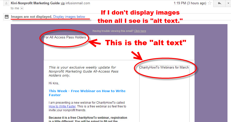
However, Alt+tag is also known as a hidden/invisible text that works behind an image. It will also express the details of an image shortly. As a result, readers with sight issues can easily understand what the image is all about.
Also read: Doing the email marketing in the right way (Tips & Tricks)
Technical Things You Should Consider as a Developer
Well, if you’re a developer and reading this blog, then you’ll also get some useful stuff here. Therefore, you can easily make your accessible emails better and reshape the email content design as well as.
So let’s check out the below points that you should keep in mind while developing an email template or email structure.
- Keep your Copy space to Breathe
- Evade Justified Copy in Your Email
- Use Semantic markups
- Apply role=” presentation” on All Your Representational Tables
- Give Attention to Layout and Tables
- Get used to with testing and tools
- Encode your characters
So these are the things that an email developer should think and utilize. However, check out the below tutorial especially for email developers, to explore more interesting things about accessible emails.👇
Also read: A Beginner’s Guide to Email Accessibility (Checklist + Resources)
Bonus: How weMail Can Support You To Make Accessible Emails
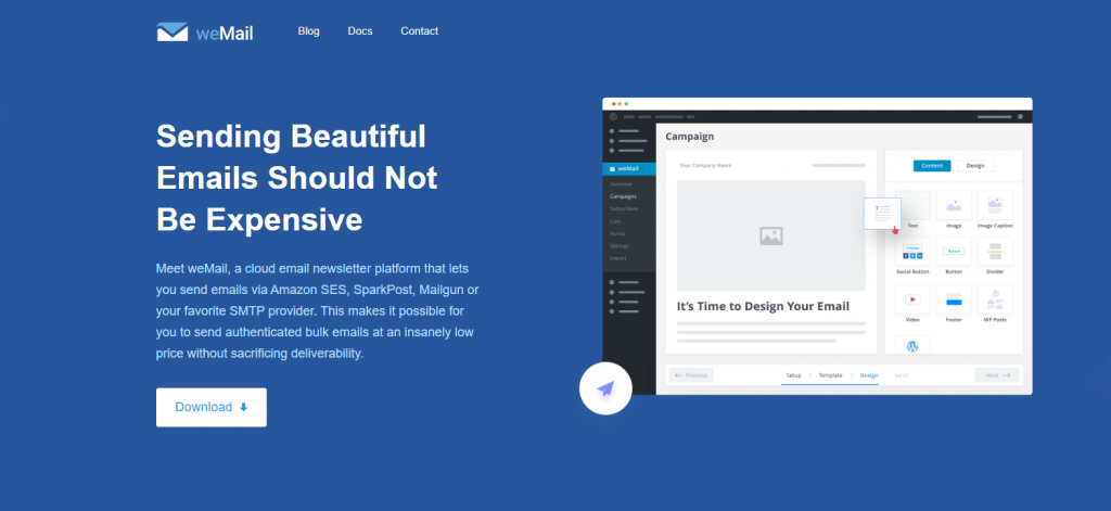
In this digital era, we solely feel the importance of email marketing and how it will continue to dominate in the near future. The reason is, email marketing can easily assist anyone to connect, interconnect, and interact with customers directly which leads to lifting up online businesses to the next level.
Well, you may have resources, enough audiences, and different solutions. So what you have to do is trigger the right button at the right time. And utilize the proper procedures step by step.
In that case, you can rely on weMail, an email marketing solution, that has the ability to draw your email marketing plans and execute them in a proper way. Also, it provides all the necessary email marketing facilities in one place.
Okay, for your convenience, let’s see how weMail can boost your email marketing ideas and help to create accessible emails, side by side.
- Multiple emails Sending gateway compatible
- Solid WordPress integration
- Multiple form building options
- User analytics
- Email listing features and management
- Import & Export
These are some notable features of weMail. So as an email marketer, it will easily enhance your chances and give you support to boost your email marketing drills. Thus you can firmly utilize accessibility in your email.
Over To You

Whether you’re a developer, designer, email marketer, email accessibility always an important thing that you should keep in mind.
We tried our best to instruct you so that it seems easier for you to create accessible emails by the above strategies we have talked about earlier.
So it’s all about you to give users the best & possible email experience, regardless of visual, hearing, or other impairments.
However, if you have anything to say regarding accessible emails or about this blog, don’t hesitate to ask us in the comment section below.




3Comments
Mazbah
Actually searched a lot of content on Google, but found this one. And believe me, You have just won my heart. Now I understand how important accessible emails are. Thanks for sharing this with us.
Nahid Sharif Editorial Staff
Thanks Mazbah
Hope you have enjoyed my article. You can also check out our other blogs. They might be looked interesting to you.😊
Pingback: Best URL Shortener Plugin for WordPress in 2021